Alexander Lim
alim@ccs.neu.edu
Group 4
Group 5
Group 6
Ethnography Study 9/28
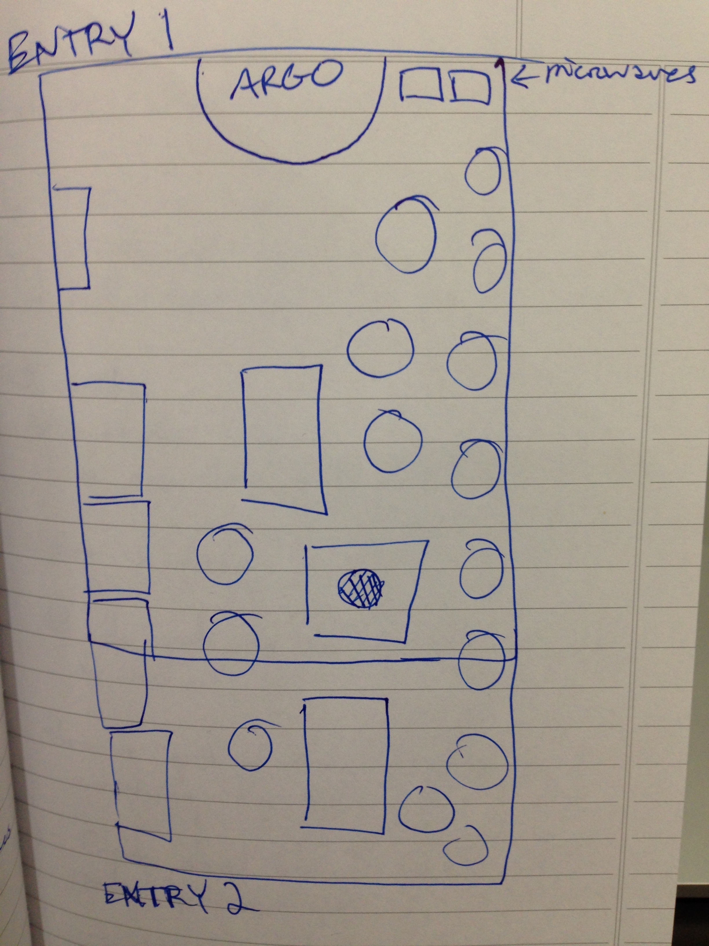
I originally planned to observe people trying to find an open study room in the library. The task is something that I myself had been frustrated with in the past due to the lack of visibility in choosing a room. I would have to circle the entire first floor of the library, looking into every room to see if it was occupied. Ironically, when I arrived at the library I had trouble finding a place to sit. The first area I found available was in Argo Tea where I realized that finding a seat there was just an extension of finding a seat in the library as a whole.
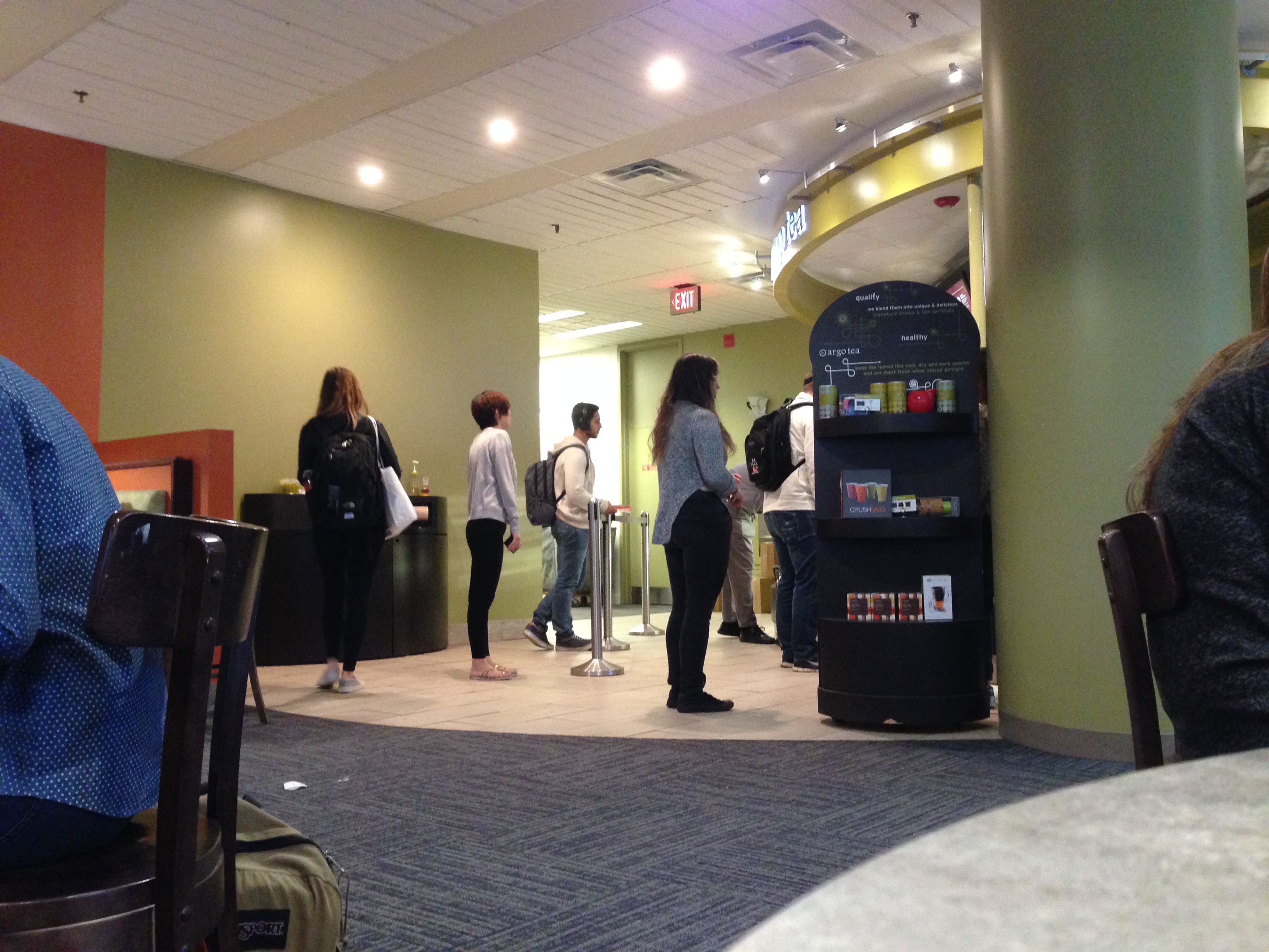
Sitting near the middle of the café facing the entrance, I watched people as they entered and took notes on how they found their seat, if at all. Most of the people I observed were students, both undergrad and grad, who came with their backpacks/bags to do work. Nearly all of the people I observed walked in and made a loop around the cafe before deciding to look somewhere else.
On average, these people spent 20 seconds looking for a seat. During my hour there, I only noticed two people find a seat immediately: a girl who arrived just as a couple left, and a boy a who made a loop around before finding his friend (after 30 seconds) who had saved him a seat.
One student I interviewed sat down in the seat nearest to the microwave in the corner and immediately put her food in to warm up. She said she chose the seat for its space and Argo because she also enjoys the atmosphere. I asked her if there was anything that could have made her experience more positive and she described some place where she could see all the seats at once as if on a map. She left soon after her food was warmed and didn’t stay to work.
Another telling observation involved a student who sat down at an empty booth. She walked by it and hesitated before finally sitting down. Throughout the entire process, she was on her phone in contact with a friend. Upon sitting down, she unpacked her bag and immediately plugged in her laptop. Shortly after, her friend arrived. In our interview, she explained that the presence of an outlet was a large influence in her decision and that she chose Argo in general for its atmosphere. However, she was hesitant at first because a booth is less conducive to working side by side with her friend.
She was not the only student using her phone during the searching process. Many individuals seemed to be using their phones to keep in touch with others friends who may also be looking for seating. She was also among all the other students sitting in booths who had utilized the outlets. All outlets at the booths were taken while seating in the rest of the café seemed to be most populated on or around the electrical outlets.
Among the students who could not find a seat, few ended up then ordering from the cafe itself. All but two people that I noticed left the cafe immediately, either exiting out the front entrance or just continuing through the rear exit.
The proposed solution I had thought of before conducting the study was very similar to the suggestion made by one of the interviewees. An interactive display, similar to the one in the Curry Student Center that displayed seating in the library. It would show what seats were available and what seats were taken. After observing the prevalent use of phones/artifacts, I realized that there was a substantial social component in finding seating. Not only did students prefer to sit either with their friends or sit alone, but students also had to keep in contact with their partners elsewhere in the library also looking for seating. A solution for addressing this would lend itself better to some sort of mobile version of the seating chart display, integrating messaging and communication.
UI Analysis 9/19
Good UIs
Spotify Homepage
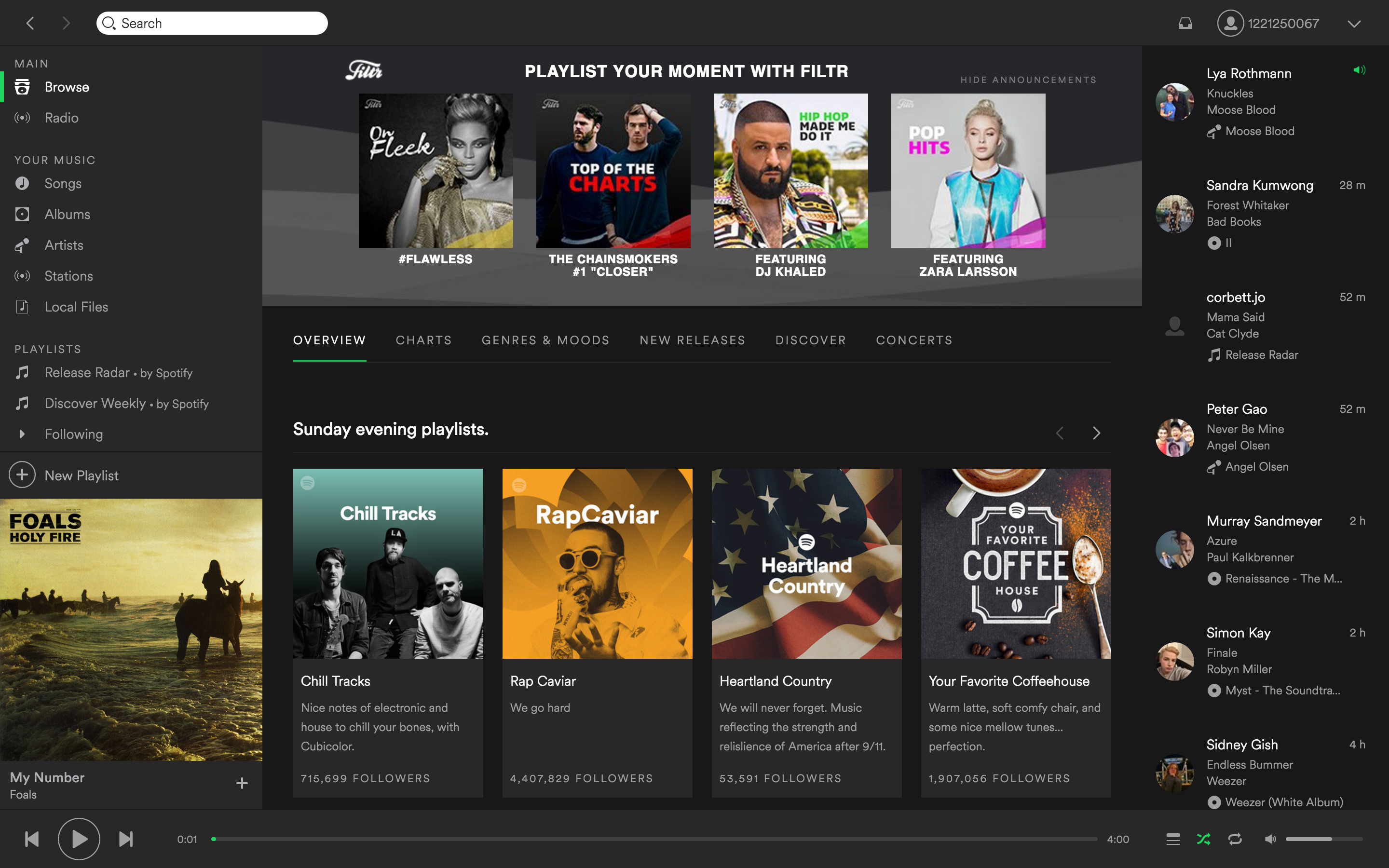
Spotify's interface is that of a typical music player, designed for everyday, routine use. It's familiar and comfortable enough for users to interact with on a daily basis. Main features include sidebars for live feeds of other users' listening activity, listening options such as playlists and radio, and the central panel for displaying the page. One of the best features of Spotify's UI is its responsiveness. While the interface is rather information dense, hovering over most of the objects on the screen indicates that it either leads to another page or is playable, shown by a play button. Its overall appearance is externally consistent with most other music players, but in the case of a slip or mistake, there is a clearly marked back/forward button and a search bar in the window.
Accuweather
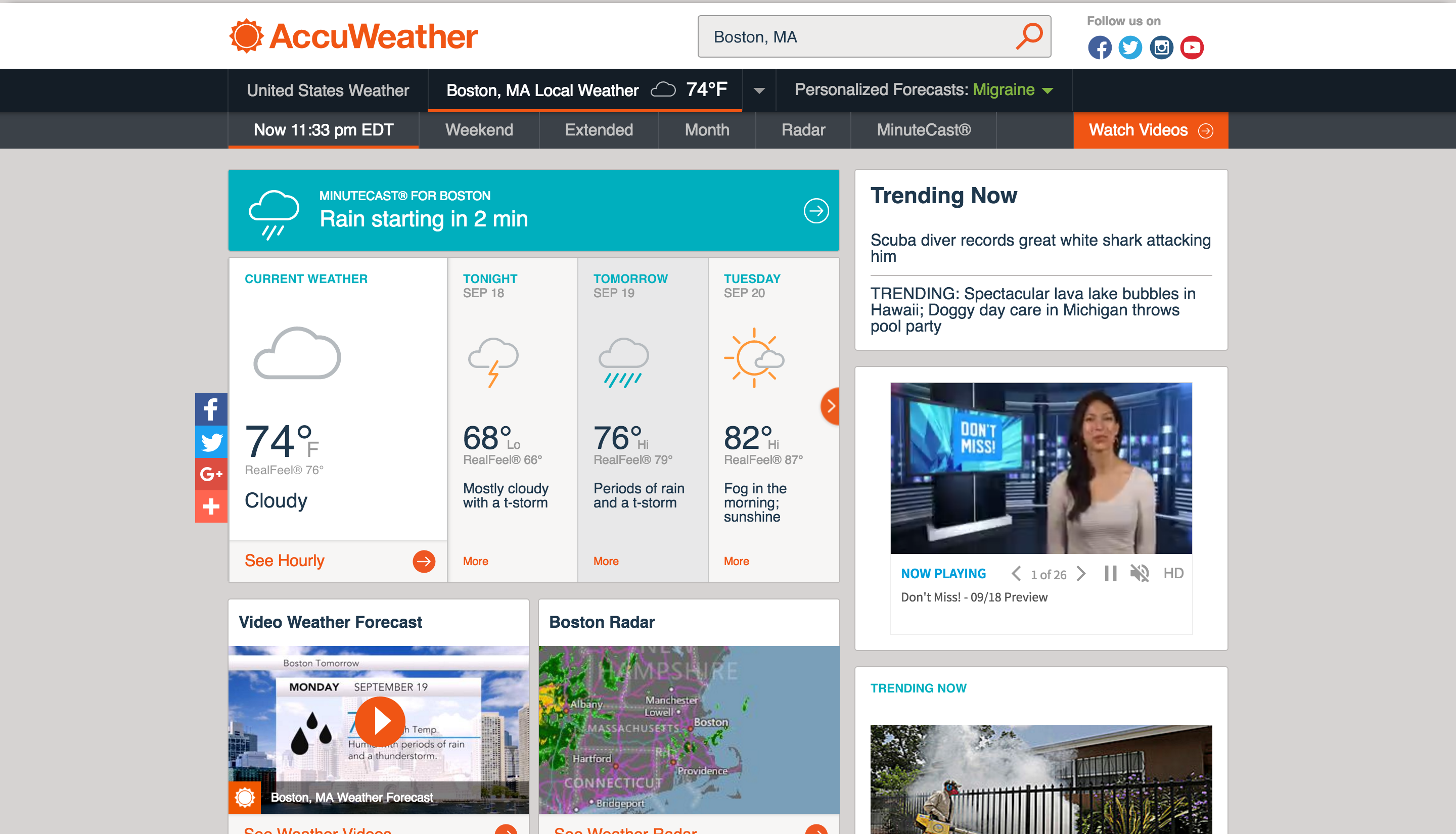
While Accuweather provides much more than just weather forecasting, many users only use the service for checking the weather. It's important that Accuweather's interface allows users to both find what they're looking for quickly, and also present additional features for users who wish to utilze them. The recent redesign of their website simplified the UI and increased the scale of forecast information on the screen. It features increased visibility and both internal and external consistency with its use of weather icons that fit aesthetically, and its familiarity with weather other weather forecasting services. Many types of users are accounted for with the UI including one-time users and frequent users -- the site saves the users frequently visited locations and displays them on the home page, providing shortcuts for experienced users.
Bad UIs
Snapchat

Snapchat's interface is designed to focus on its camera, but also allow for easy navigation to its other pages: chat, stories, memories, settings. These can be accessed by either swiping in specific directions, or clicking the appropriate buttons. The recent update introducing its new "Memories" feature mainly introduced a significant cause for user slippage. The placement of the button to access this feature is directly below the button to take a photo. In my personal experience, I've missed several photos after accidently hitting the Memories button and then struggling to undo and return to the camera page. The exits are not clearly marked, and I only just recently discovered how to recover from this slip. I think that this was designed with the intent of having Memories be a widely-used, prominent feature of Snapchat, however, I would create a separate button elsewhere on the screen so as to not interfere with the function of the camera.
Fitbit Alta

The fitbit's interface has many constraints to work around. Due to the nature of the device, screen size is limited and buttons are difficult to implement. Tapping the screen is the main mode of interaction to switch between the fitbit's features that cycle between step count, distance, calories burned, etc. My biggest complaint with the design is the lack of exits or error prevention. I often tap to check the time, but slip by accidentally passing the clockface and going to the next feature. The only way to recover is to continuously tap until the user reaches the beginning of the cycle again, where the same slip can be repeated. I think this was designed conscious of the potential flaw but without the resources or ability to remedy it. If technology/resources permit, I would suggest that users be able to tap to cycle left or right through features rather than just one way.
Project Ideas 9/12
JFK International Airport Website
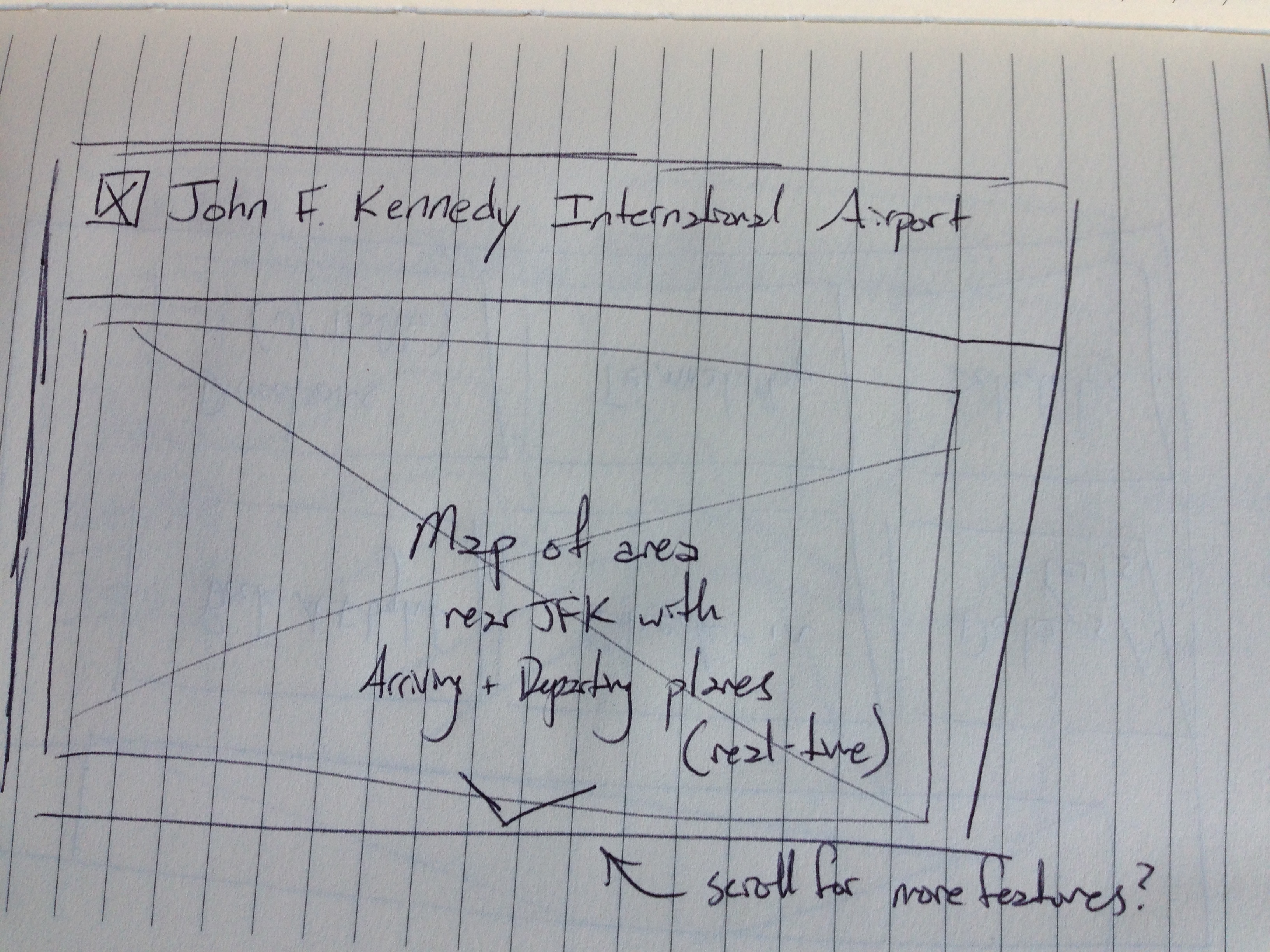
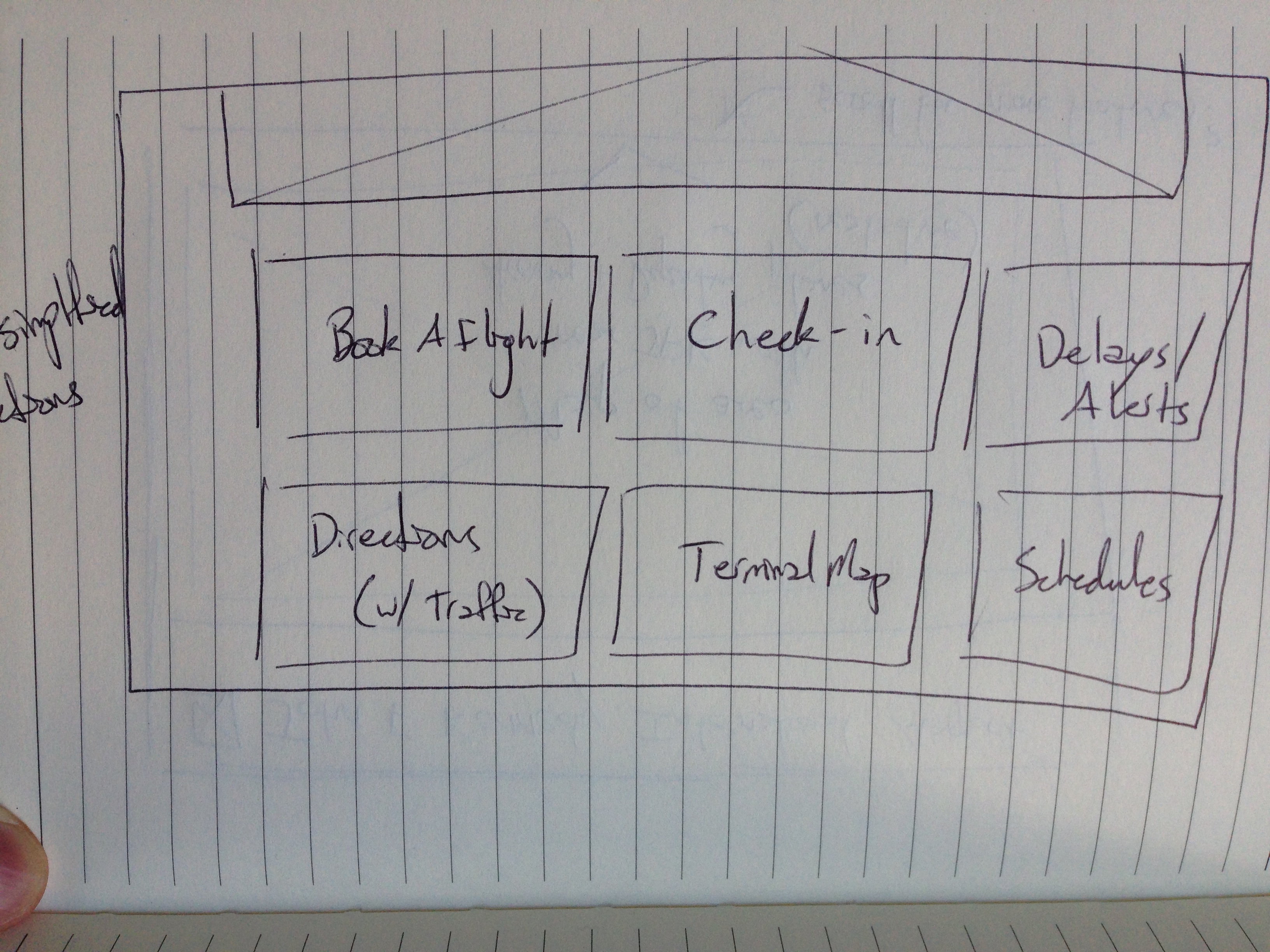
The current, and any airport site in general, contains many resources for its users. While JFK's site is functional and effective, I'd like to clean up its interface. Comparing it to other airport sites, the interface is very dense and information heavy. My goal is to simplify the user experience to be understood across language barriers and international travelers. See Laguardia Airport's site for inspiration. I'd also like to entertain the idea of a real-time, interactive map of flights arriving/departing from JFK.
CCIS Website
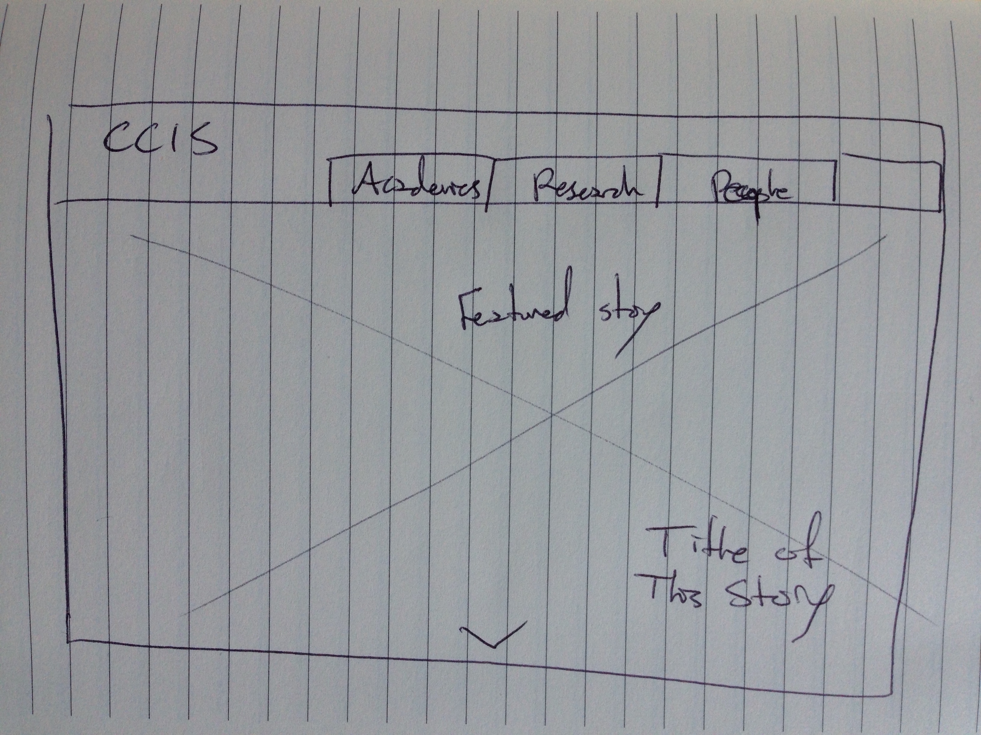
Even though the site was just redone, the CCIS website leaves much room for improvement. The combination of background images and text hinders legibility. As a resouce for incoming freshman and NU applicants, it's important that the site be easy to navigate. I think the current navigation bar on top works well, but the remaining body of the site needs to be cleaned up and the non-traditional use of the grid should be revised.
MBTA
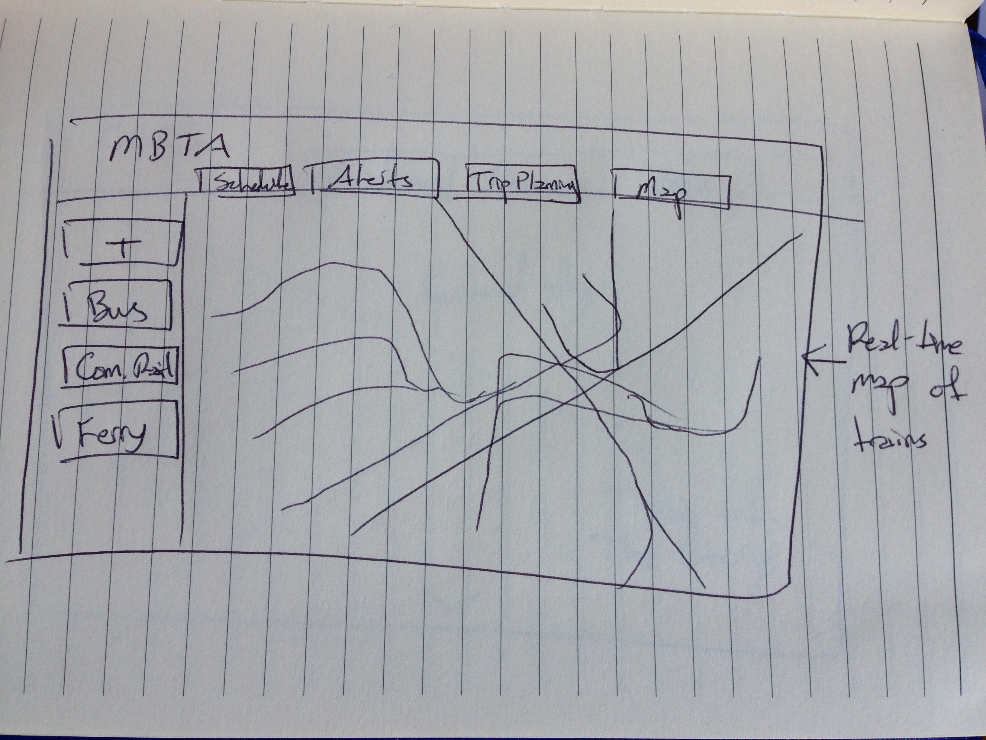
The MBTA site is also cluttered and too dense, there's too much information on the landing page to process. I propose to organize all of the information into understandable terms centered around an interactive, real-time/real-time inspired interactive map of the MBTA system. The site would be broken down to roughly 5 sections for trip planning, scheduling, alerts, etc. to limit the number of choices a user has to make.