Group 5 - MyCampus
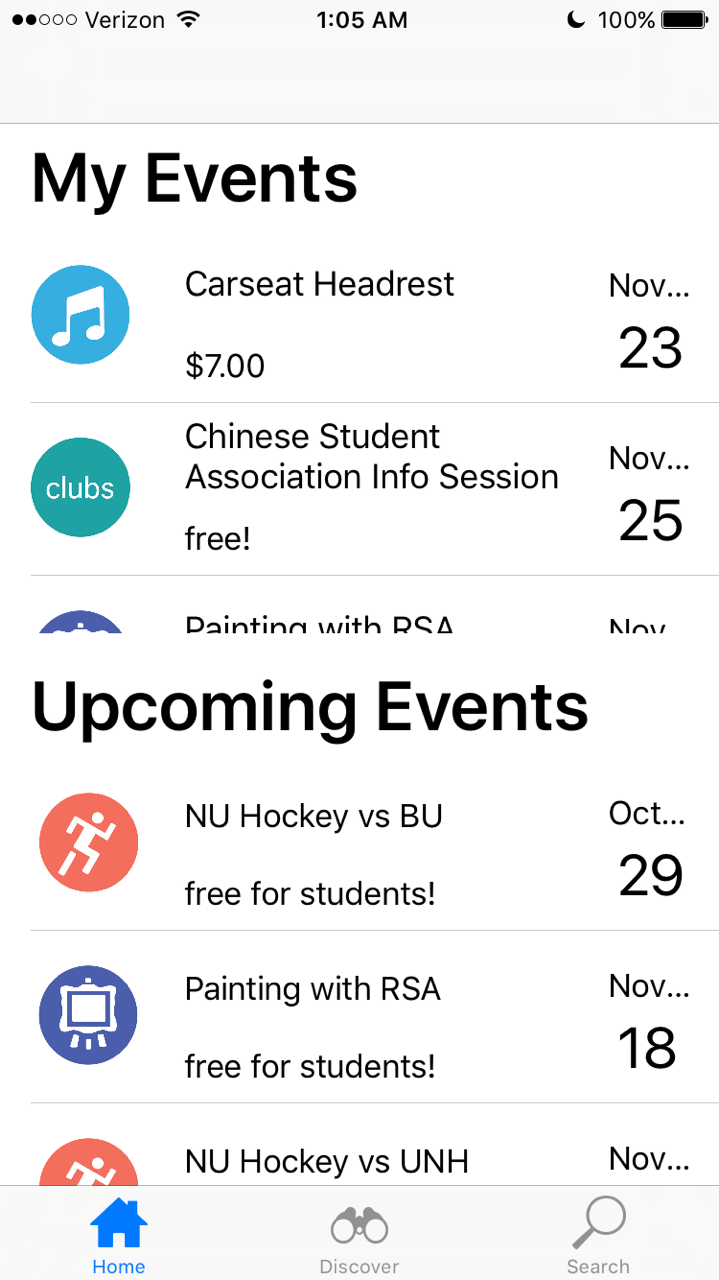
1.It’s difficult to browse events with the scrolling list space so limited. Especially when I don’t have any current events, it seems like a waste of space to include current events at the top and serves as extraneous information. I think a remedy to this would be to scroll down from “My Events” to have the “Upcoming” list fill the screen with the title “My Events” pinned to the top maybe -- like how the iOS reminders lists work.
Design Heuristic: Minimize User’s Memory Load, Simple and Natural Dialogue, Visibility
Severity: Catastrophic
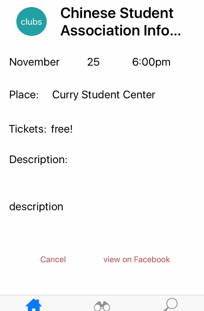
2. It would be nice to have more explicit feedback regarding RSVPing to an event. In addition to having the option to cancel, maybe include an indicator or icon with the status “going” or “attending,” that might lend itself to implementing a “sharing” feature to let your friends know that you’re going.
Design Heuristic: Feedback
Severity: Minor
3. Some of the events are out of order chronologically.
Severity: Cosmetic
4. As a student and avid sports fan who attends every hockey game of the season, I would like to subscribe to or follow an organization that hosts events so that I don’t miss any and stay updated.
Design Heuristic: Shortcuts
Severity: Suggestion
5. I don’t think it’s necessary to have events listed beneath the search bar on the search page. I think it might be a bit distracting and takes away from the focus of searching.
Design Heuristic: Simple and Natural Dialogue
Severity: Cosmetic
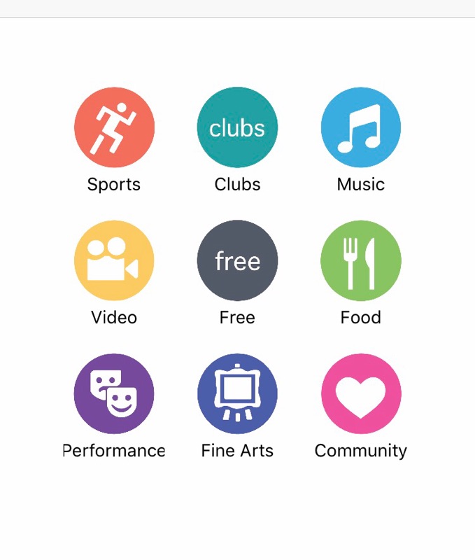
6. I like the use of icons and think it’s pretty effective, especially when arranged as categories in the discover page. The clubs one feels a bit out of place though.
Severity: Good
7. I think adding a profile feature would make a lot of sense. It could store the list of organizations you follow, the events you have scheduled and past events you’ve been to. Maybe that’s where “My Events” would go, or be shown again.
Design Heuristic: Shortcuts?
Severity: Suggestion
8. I’m not sure if the date should be on the right side of the screen. I feel like that information should be higher up in the hierarchy and should be on the left, either replacing or next to the icon. Similarly, maybe instead of the sub-information being price, it could be the student organization/host.
Design Heuristic: Visibility
Severity: Cosmetic
9. Maybe another feature could be a calendar view that displays views of all upcoming events and/or your events.
Severity: Suggestion
10. Aesthetically pleasing. Colorful icons are a nice complement to the otherwise clean and simple design. I think the information on the events could use a bit more organization though. I think the date should not be spaced out from the month, and an end-time should accompany the start time.
Severity: Cosmetic, Good