Group 6 - UPS
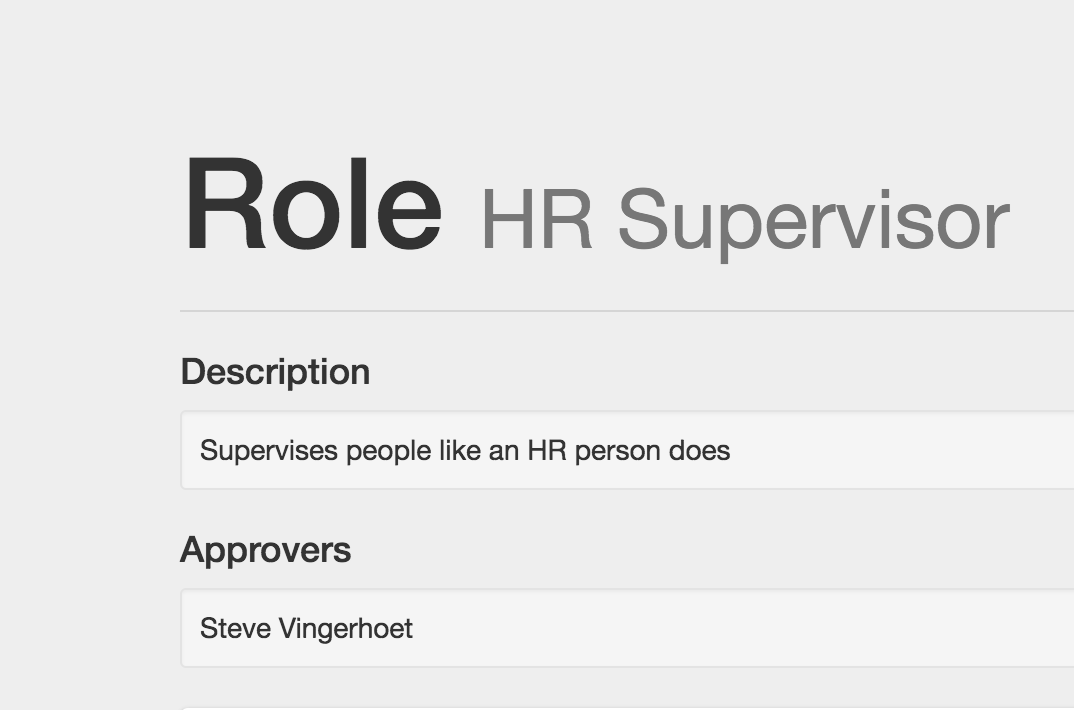
1. I’m a bit confused by the term “role” since it doesn’t always correlate to a (human) responsibility, rather a level of authority/access privilege like you describe in the brief. This might also just be a learnability issue since I’m not the intended target user.
Design Heuristic: Speak the User’s Language, Learnability
Severity: Minor
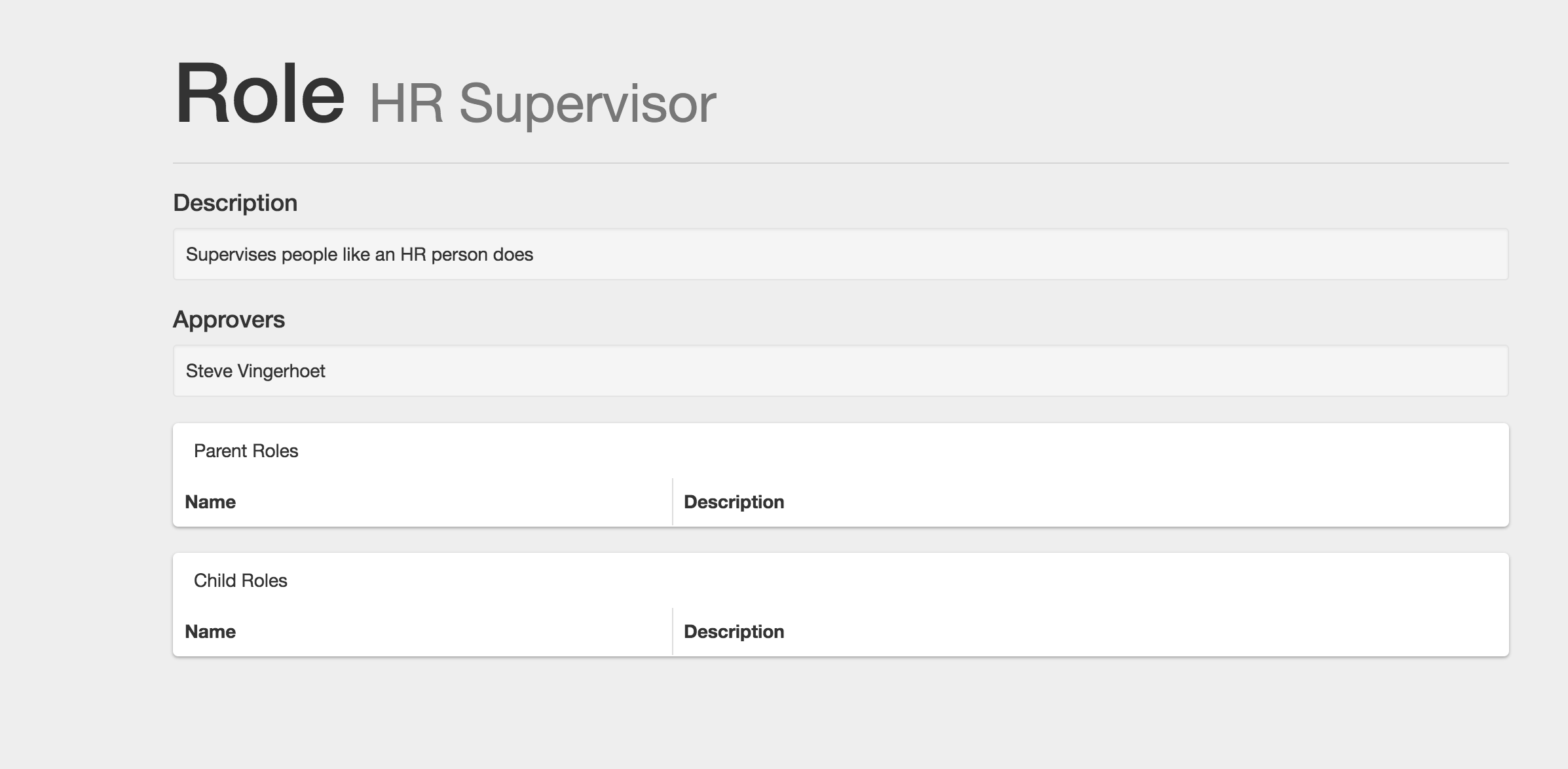
2. After submitting a new role, I think there should be some sort of navigation back to the home page like a “Back to Dashboard” button. Currently, it seems like I have to click the home button in the top corner.
Design Heuristic: Clearly Marked Exits
Severity: Minor
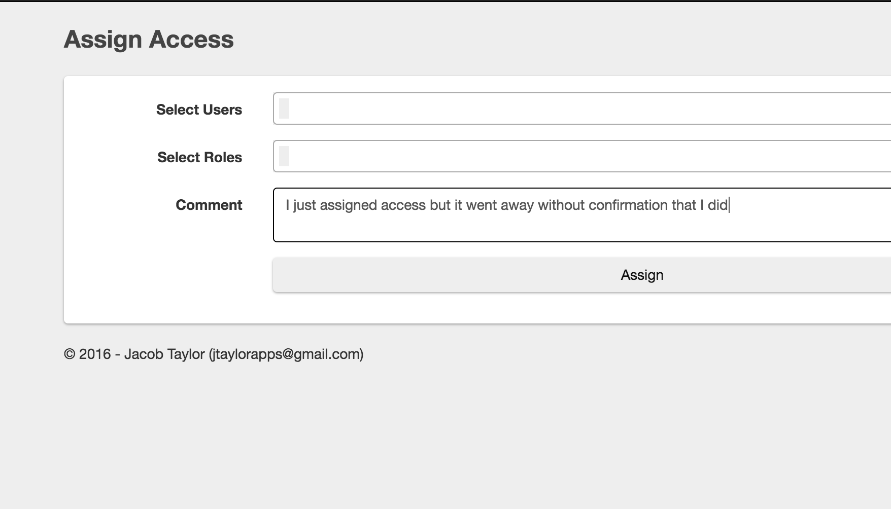
3. I think a confirmation page after creating a new role would be very helpful. Before finally creating the role, you’re prompted to check over the information and then click “submit.” On that page you could then add features like “Edit,” “Create Another Role,” or “Return to Home” etc. especially important if I made a mistake in my information -- is there a way to undo/fix it?
EDIT: Same for the Assigning role request page.
Design Heuristic: Preventing Errors
Severity: Catastrophic
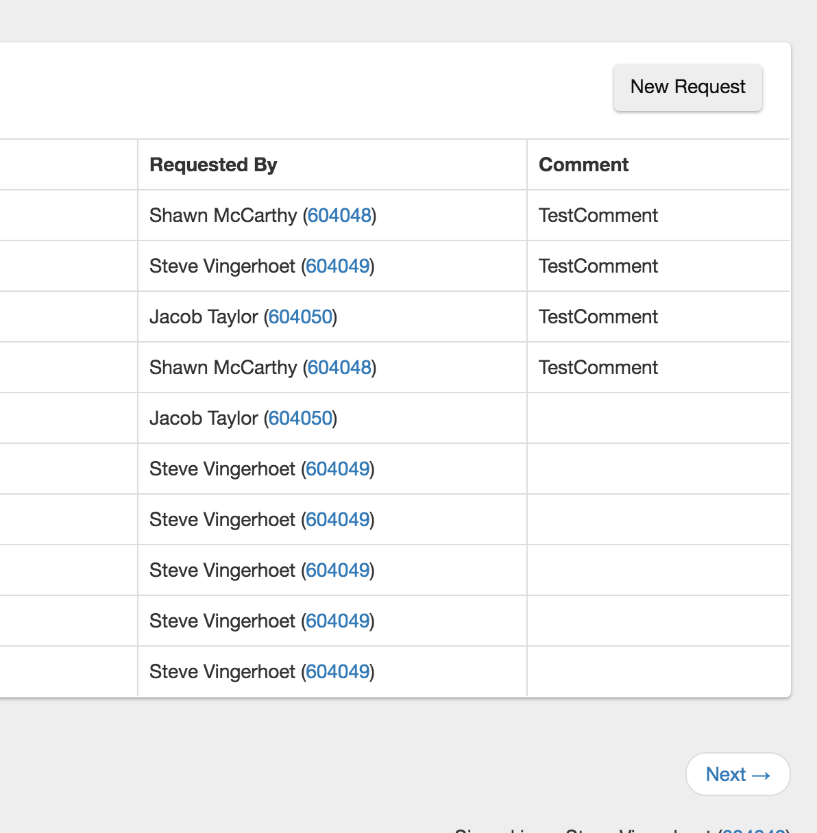
4. I didn’t notice the next button at first and was very confused as to why my newly created role was not there. I think this could be improved by indicating that this is page 1 of 2 and/or moving the next button closer to the list/to the left.
Design Heuristic: Visibility
Severity: Major
5. Task-related: It might be helpful to have a list of the names you have registered in there already as part of the brief. But similarly, I think the feature of searching by at least 3 characters is more a hinderance than a help. Hypothetically, I might not know how to spell someone’s name and not be able to add them.
Design Heuristic: Preventing Errors
Severity: Major
6. I assumed that I would be able to add request for a specific role on that role’s page, and when I checked the Requests page for the first time, I didn’t notice the “New Request” button at first, maybe make it more visible? A different color maybe?
Design Heuristic: Visibility
Severity: Minor
7. I’m not sure I understand what the purpose of the “Users” tab is. But because I didn’t feel the need to use it for any of the first two tasks, I didn’t know who the users I could add were. Maybe a setup wizard/guide to understanding the interface would help with learnability.
Design Heuristic: Help and Documentation, Learnability
Severity: Minor
8. Not necessary, but maybe add the title “User Provisioning System” or just UPS somewhere on the page. That might be able to replace the home page icon -- have the text instead of the icon.
Design Heuristic: Visibility
Severity: Cosmetic
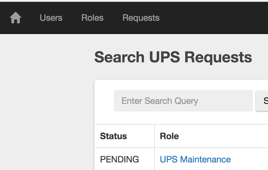
9. The placeholder text in the search bars could be customized to each page. I think having it say something like “Search for a role” instead of “Enter Search Query” would be more effective.
Design Heuristic: Speak the User’s Language
Severity: Minor
10. The user profile icon in the top right is not easily noticeable. I think that would be an appropriate place to put the logged in user’s name or other relevant profile information.
Design Heuristic: Visibility
Severity: Cosmetic