Our Problem
At a school with a student population as large as Northeastern University’s, it can be overwhelming to keep track of all the different events on campus, especially for new students. On any given day, usually upwards of five or more events are happening on campus simultaneously, many of which are free or open to anyone on campus. Many times, students walking around come across an event on like a BBQ without having had any idea that it is happening. Although Facebook provides a space to post the events, no cohesive space exists that lets students see all of the possible events happening on campus. Also, especially as a freshman, it is much easier to just go to the same events that friends are going to. This app makes it easier for Northeastern students to discover new clubs and events based on their individual interests rather than only hearing about events that their friends have shared on Facebook.
|
||||||||||
Target UsersOur targeted user population consists of first or second year students attending Northeastern that would like to attend more events around campus, whether to join a club, meet more students, or simply find something going on that night. However, the app is useful for all other students on campus as well. |
||||||||||
Solutions |
||||||||||
Noah Appleby |
|
1. This sketch lays out the pages that I explored in these sketches, and shows the overall design of each page. It's based off of the current Apple Music design, as I figured that our app should be fairly familiar to its users in order to be accessible. This lays out the title above, the content in the middle, and the clear number of pages in the app. No features would be hidden, everything is visibile to the user. Each page is a different take on conveying events to the user, and not all would be used in the final product as they are redundant for brainstorming. |
|
|
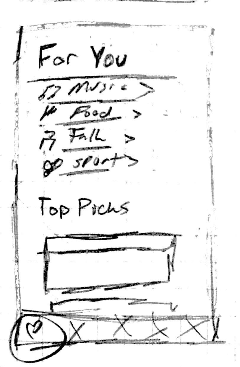
2. This is the For You page, where the user can sort by categories and view their top picks. The matches will be based off of the user's facebook likes, as this stops us from having to put them through a 'profile creation' process. Scrolling down this page would populate it with events, which display in one standard window format across the app with a title, description and photo. Clicking on it 'add' would add it to your favorites page in the app, and also open then open the event page up in Facebook for more detail. |
|
|
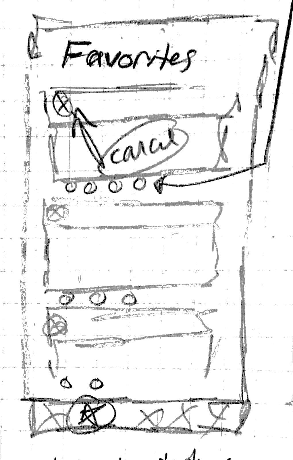
3. This is the Favorites page, where the user can view events that they marked as attending. Apps on this page will trigger notifications of date/time changes, and reminders to the user. Items on this page will also automatically be added to the user's calendar. Below each event will be the icons of all of their friends who are attending, which would help them make the decision quicker. |
|
|
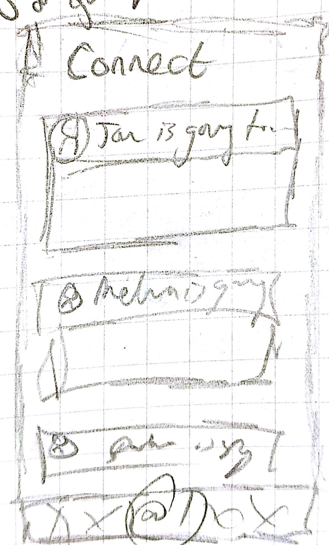
4. This is the Connect page, where the user can view what events their friends are going to. This is a form of browsing events, and the user can then choose to join, in which case their friend would be notified. These are sorted chronologially, as it allows the user to make last minute plans on lonely nights. |
|
|
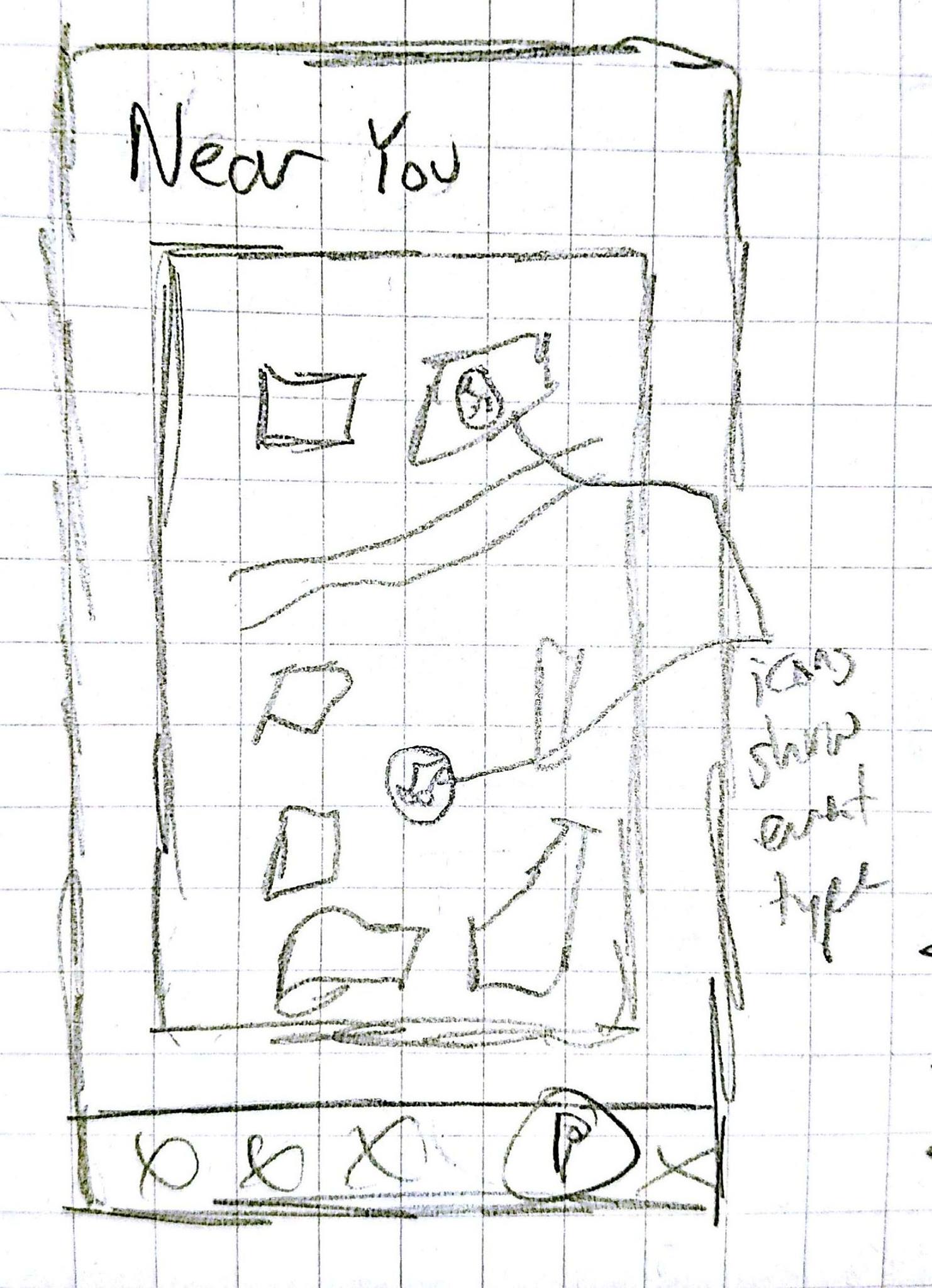
5. Finally, this is the Near You page, where the user can see what kinds of events are nearby them. Events would be marked by category icons, the same ones used in the For You page, allowing them to get a quick glance at activity nearby to them. The app would likely default to this page when opened, allowing the user to quickly get a read of events when they are on campus. If a user opens this while off campus, it would likely default to a location such as centennial, central to campus, allowing them to still browse while on the go. |
|
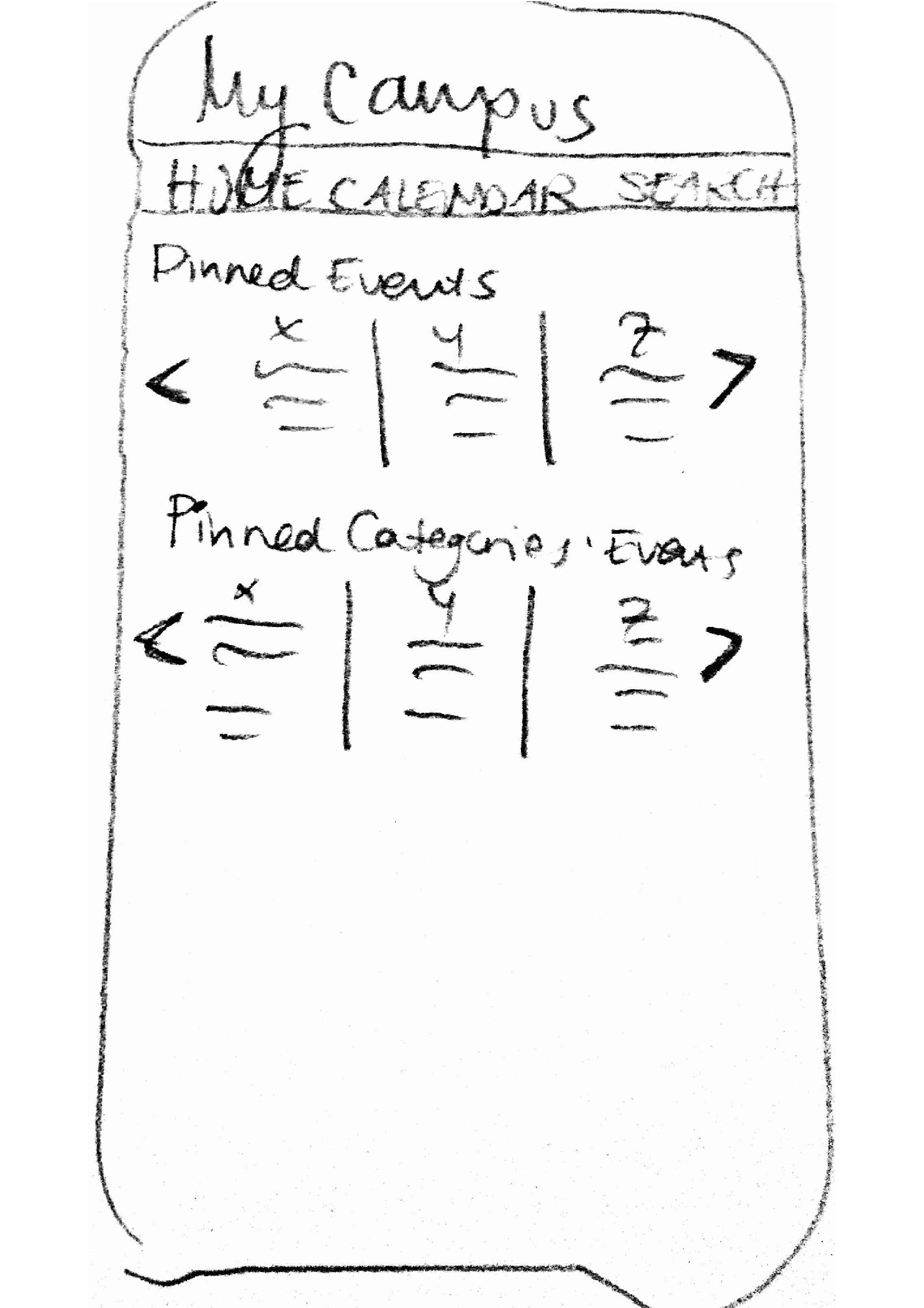
Jon Corbett

Bahar
|
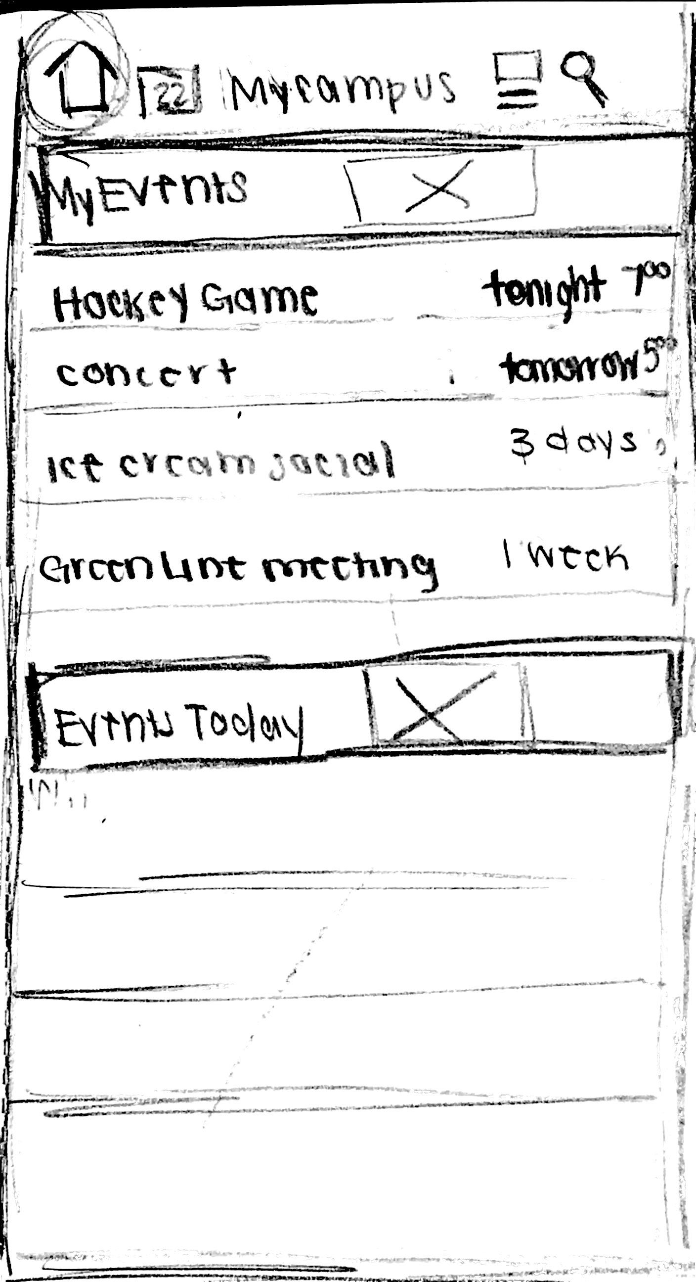
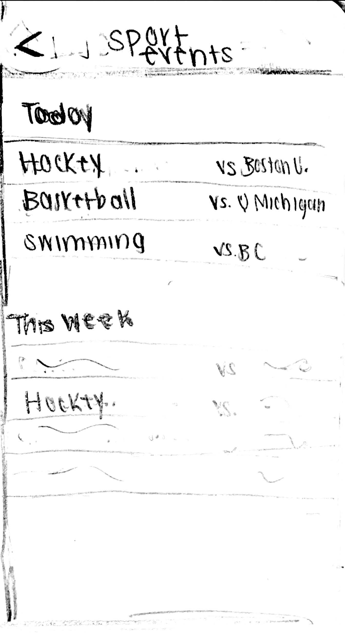
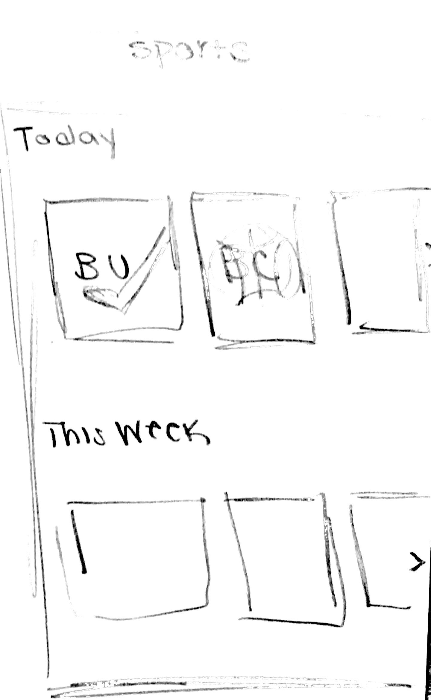
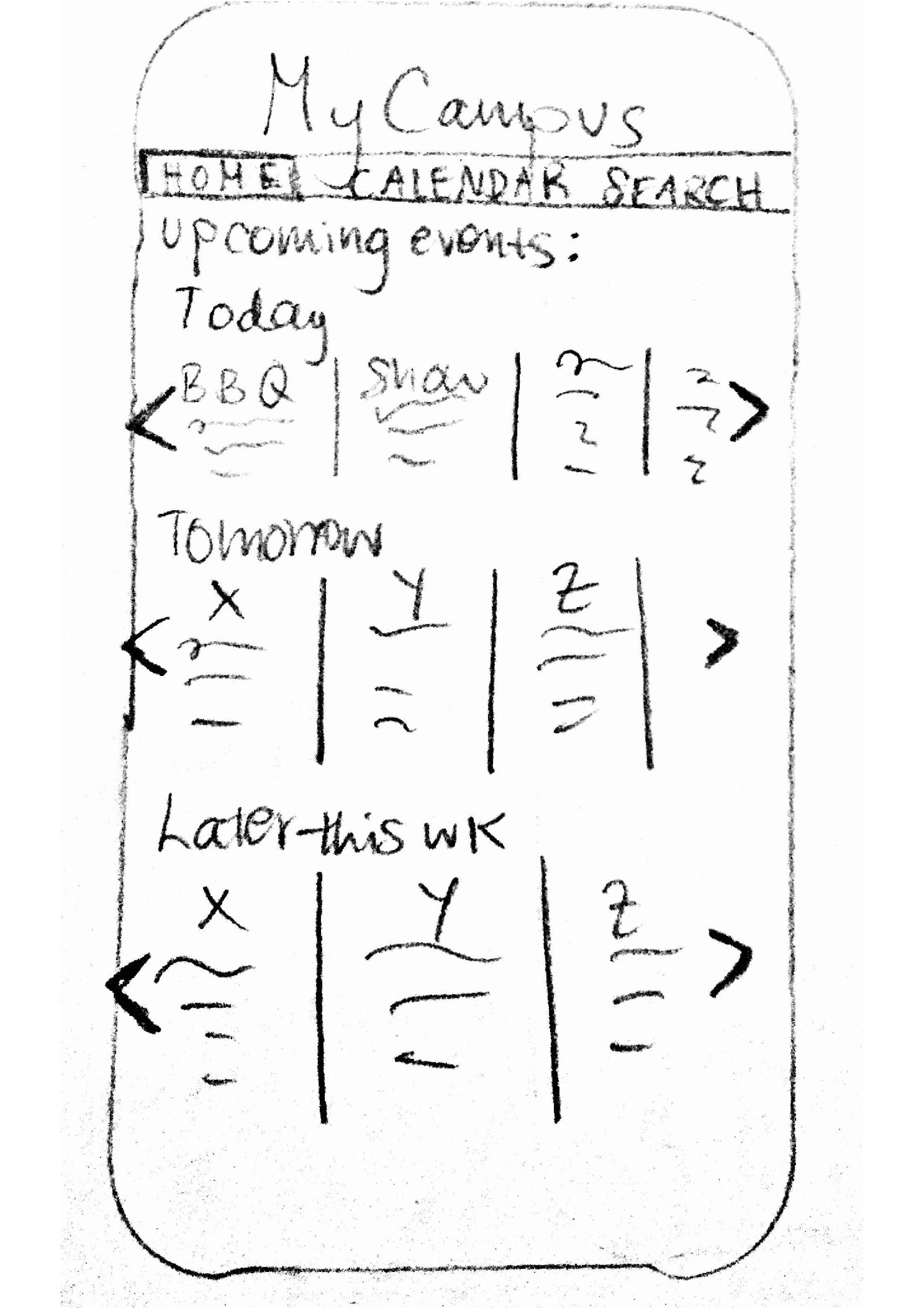
1. This is the homescreen of the MyCampus app. It includes all events on campus for the day of, the next day, and later on in the week. It uses arrows on the left and right side to swipe through events. A menu at the top of the app allows users to navigate through through app. |
|
|
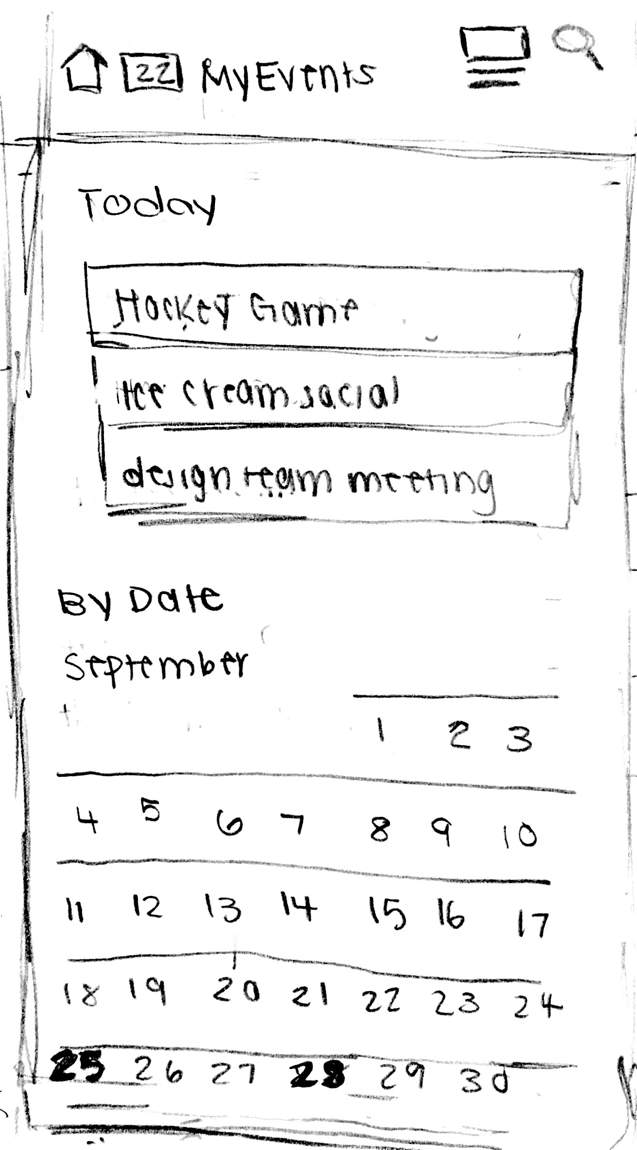
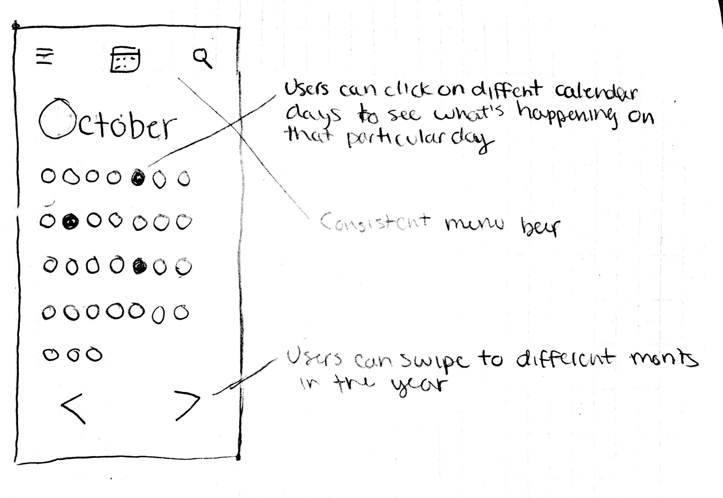
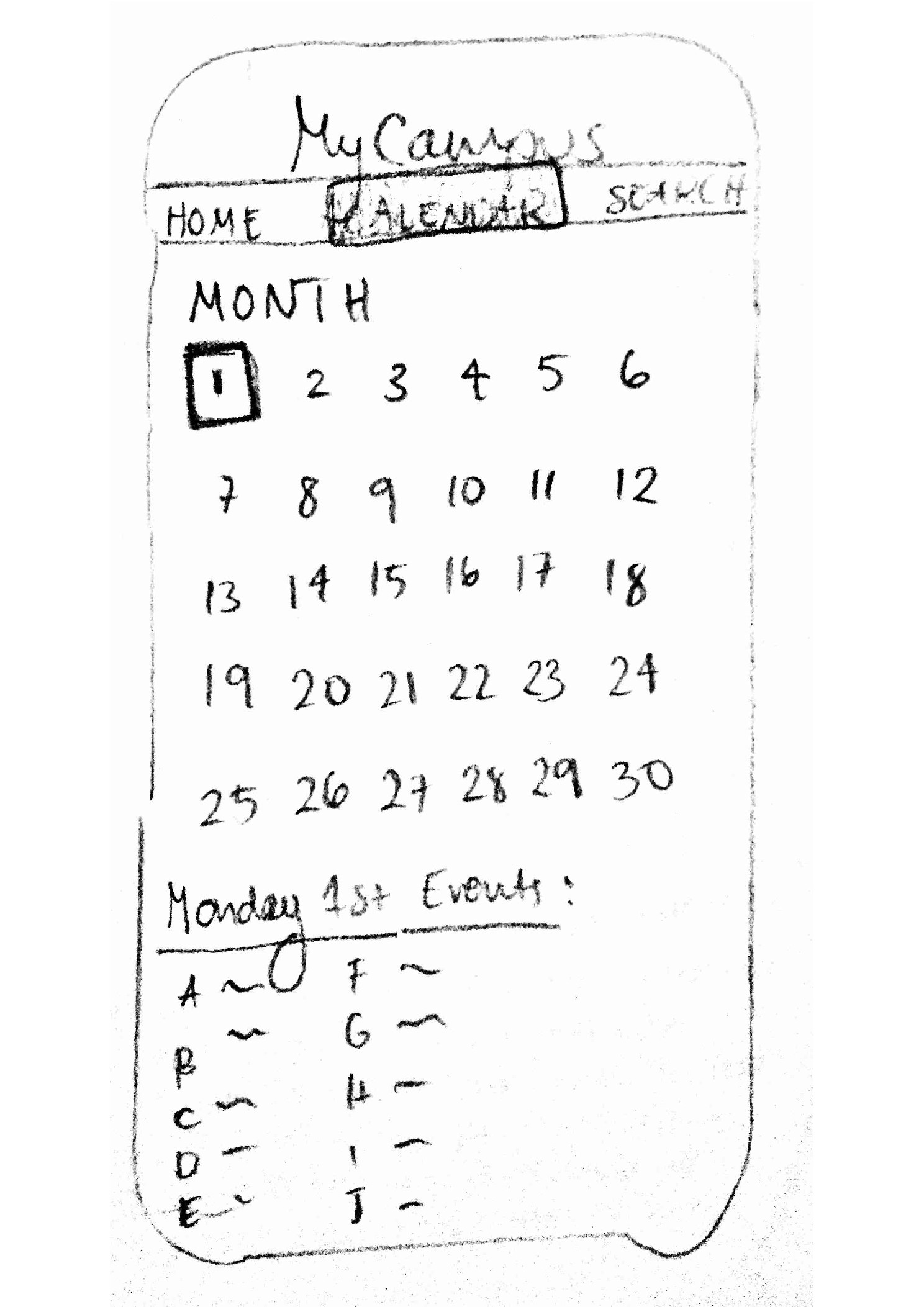
2. The calendar view makes all the events for the month visible. By tapping on a day, users can see all the events on the respective day. Displaying events based on time like this allows selection of events based on availability for a particiular day. |
|
|
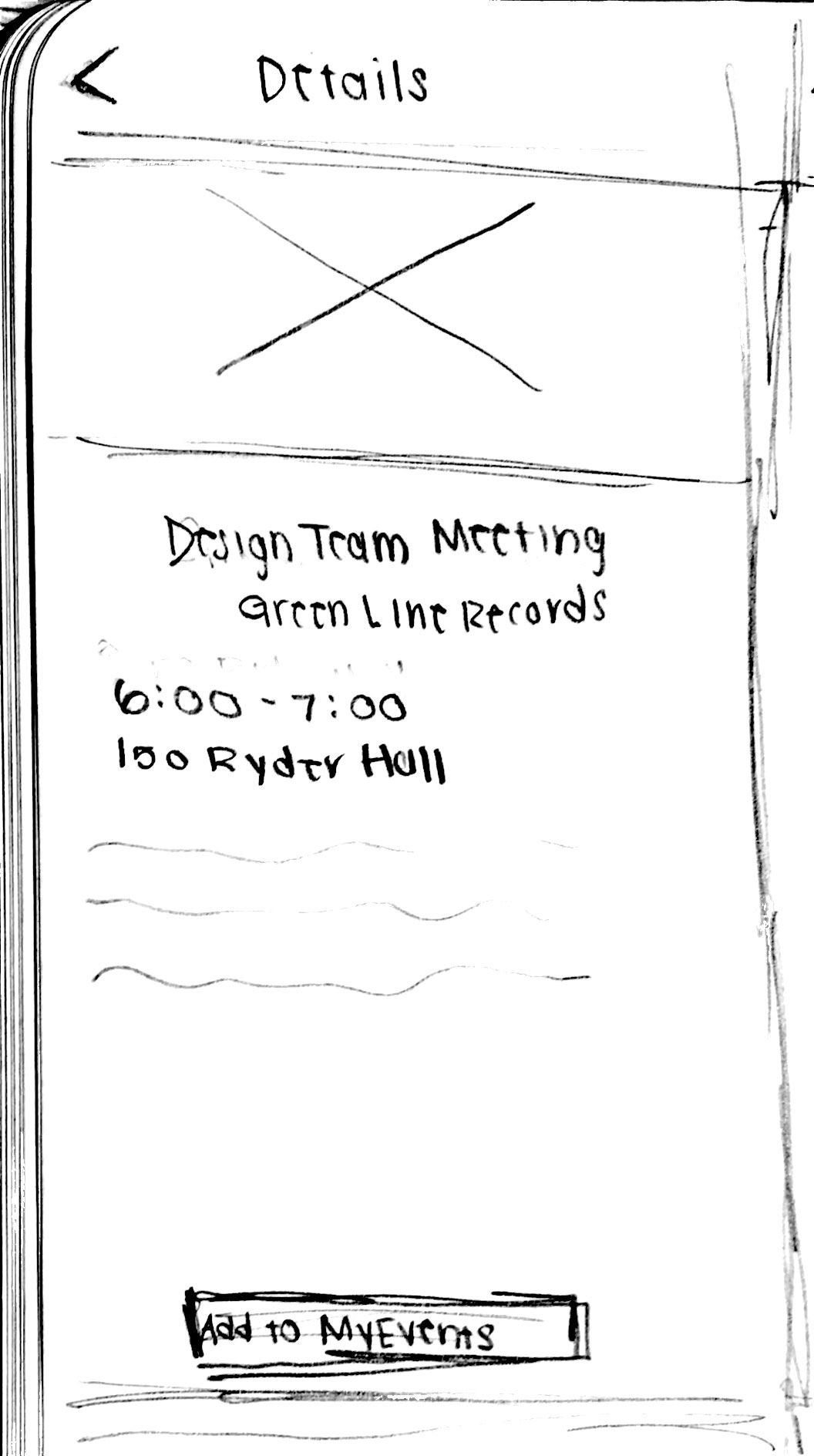
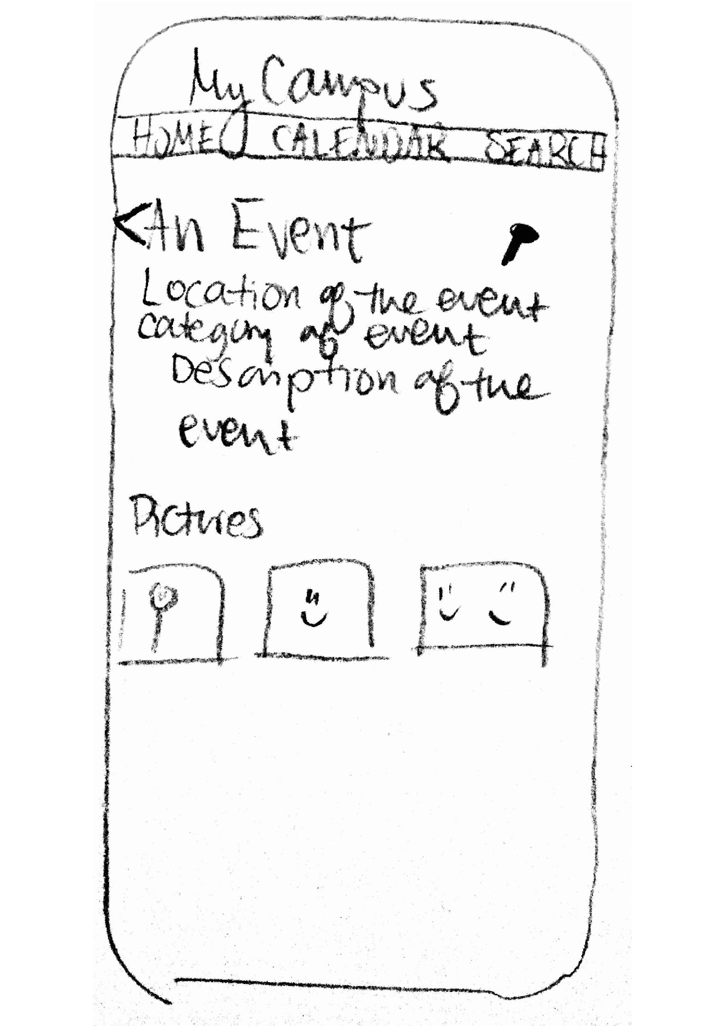
3. Once interested in an event, a user can get detailed information about the event by tapping on it. The detailed information will include location, category, decription of the event, and pictures if any are included on the Facebook page. Additionally, if the user decides to attend the event, they can pin it for further reference. |
|
|
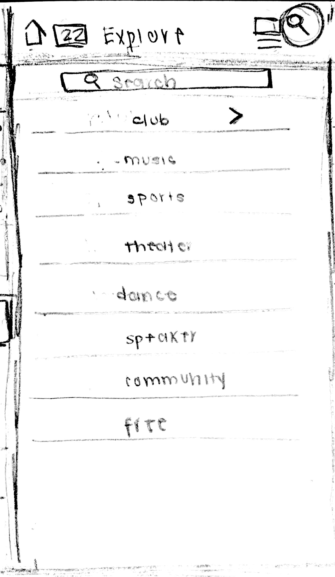
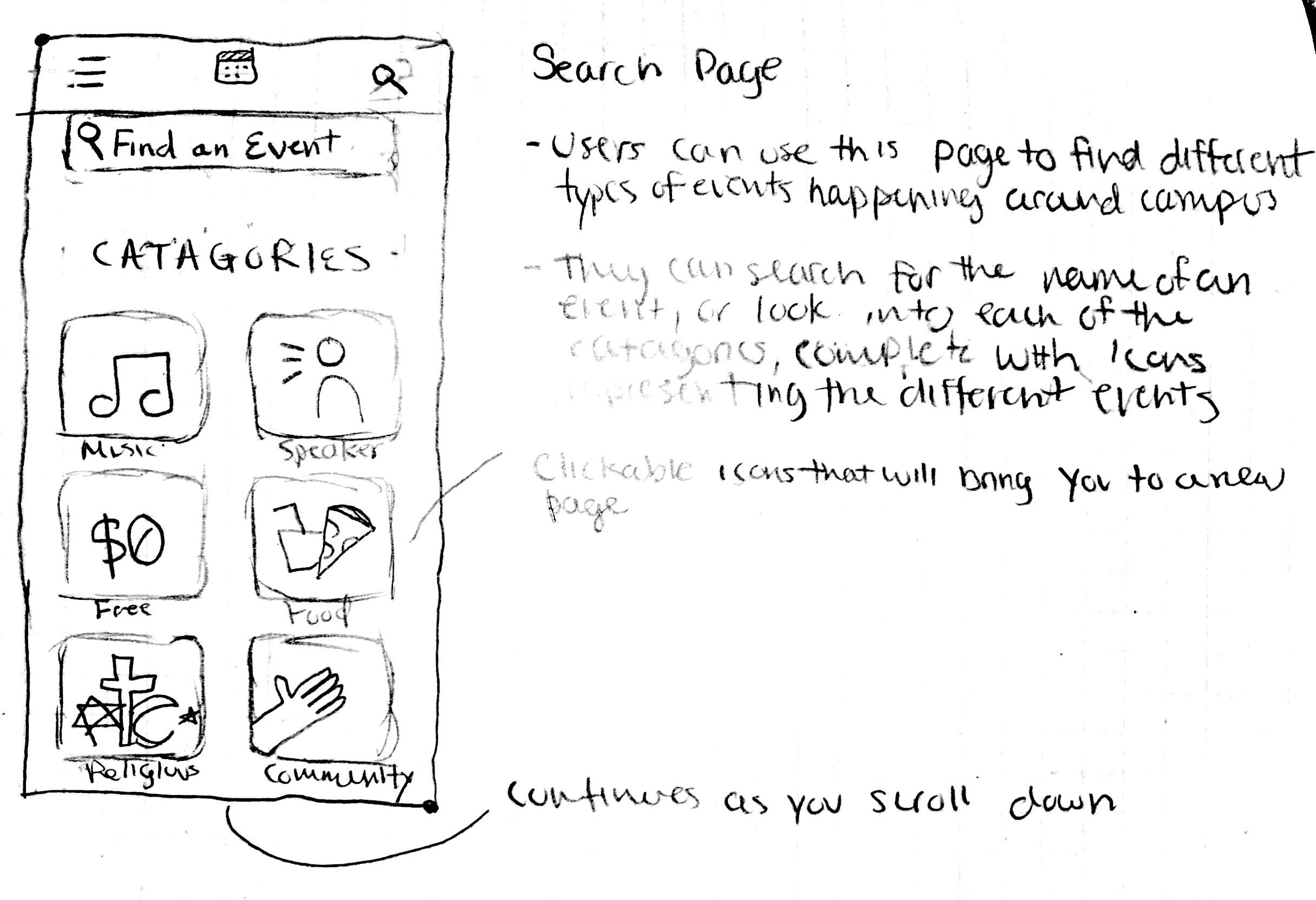
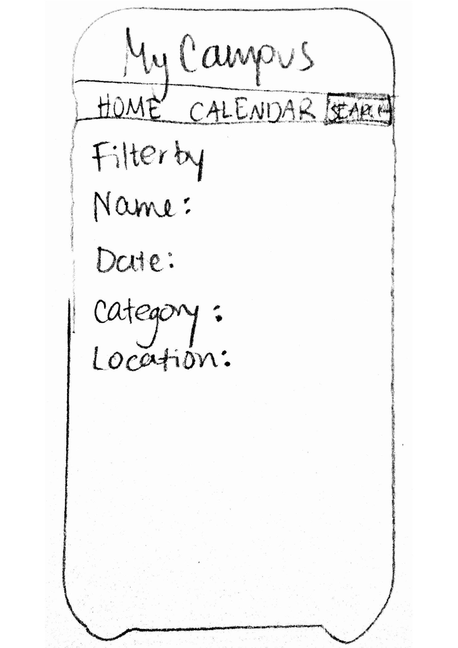
4. If the calendar or homescreen is not sufficient for finding a particular event, users can search for it based on category, time of the event, location, or name. The category and time options will be displayed for selection in a drop-down menu to prevent error. This search screen is easily accesible from the menu at the top of the screen. |
|
|
5. To choose events to refer back to, there is a personalized page for pinned events and categories. In this way, users will be able to keep track of events or categories of events that interest them. Two arrows allow swiping among the events, which is consistent with the homescreen. |
|