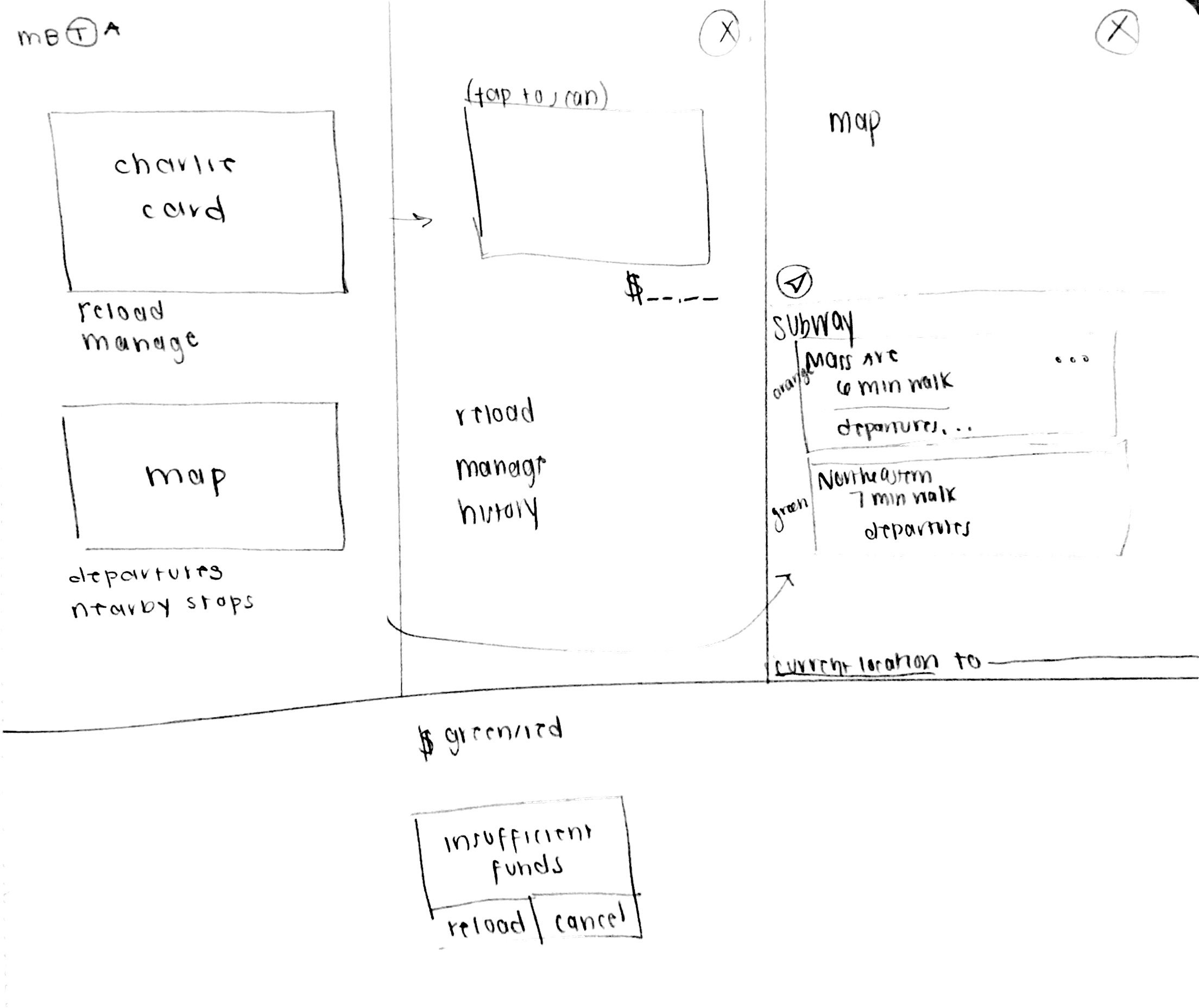
An official MBTA app with a focus on departures of trains and online ticketing. This app would provide a map that shows you the nearest train stations, as well as display the next departure times of the trains. Furthermore, it could find the quickest way to navigate to the provided destination. Through online ticketing, the app would allow you to scan past the turnstile by clicking on the image of the CharlieCard. Displaying the current value on the card would allow users to know when they have insufficient funds, as well as allow them to recharge it at any time on the phone.
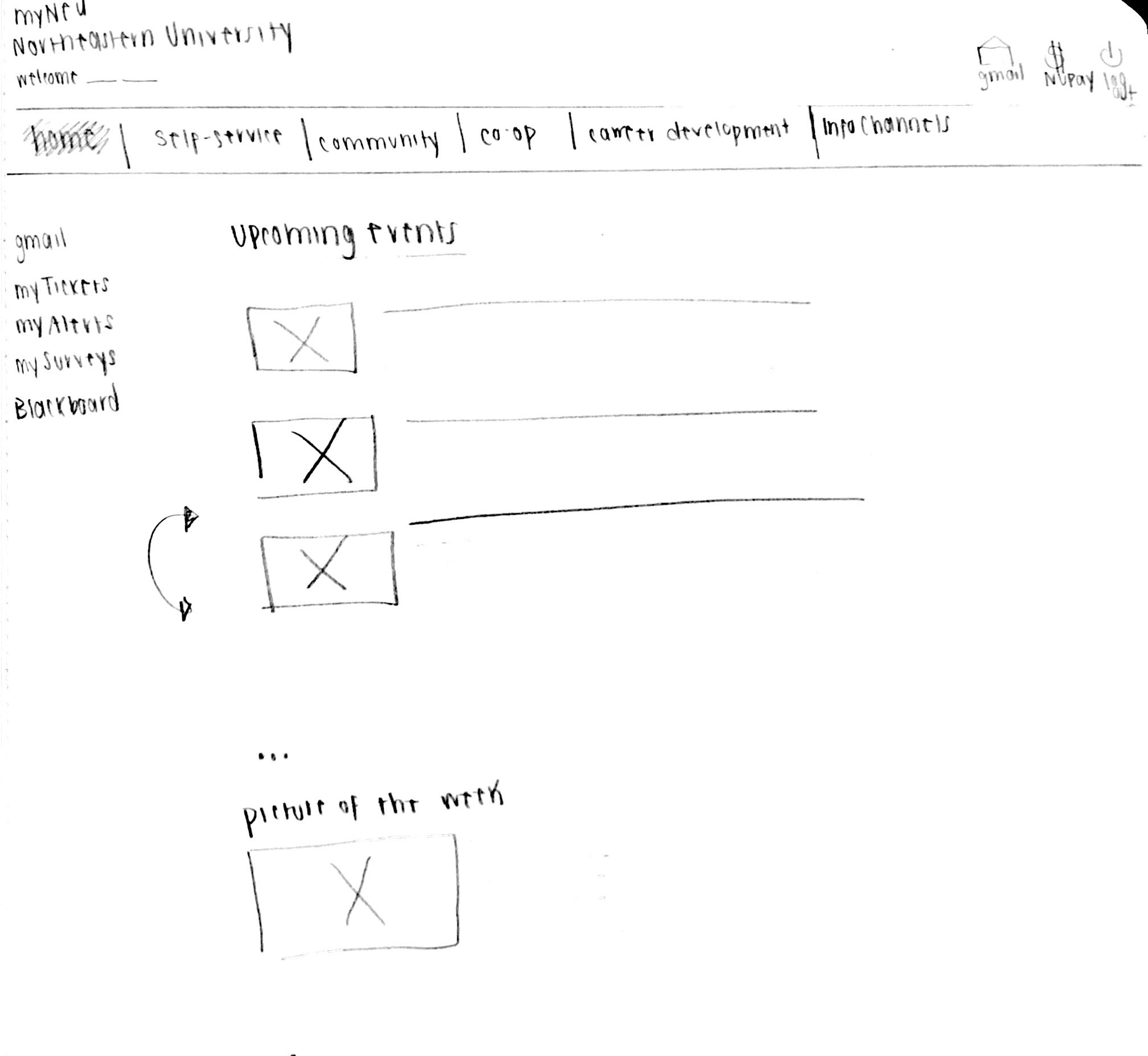
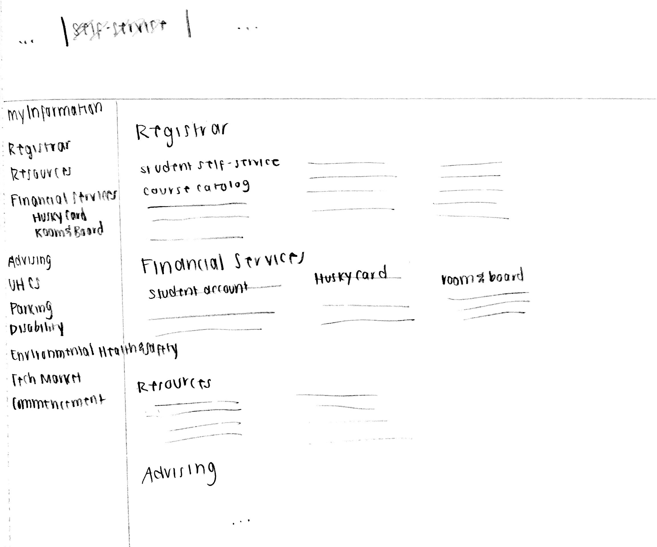
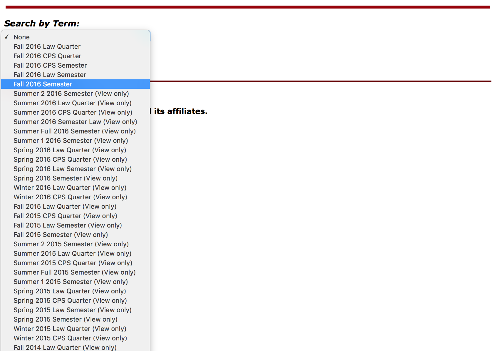
Many students find myNEU not only aesthetically displeasing, but hard to navigate. Through redesigning the site, I would focus on a cleaner tab bar on the top of the main pages. The home page would also have a left tab bar of quick links; however, instead of the block format throughout the site, it would have one main scroll through the news, upcoming events, and picture of the week. I would also redesign the self-service page so that, again, instead of the panel format, it would scroll across each header with the links organized in columns horizontally. I think this would make it easier to navigate. There could be a left tab bar again for easier access for a quicker, direct approach.
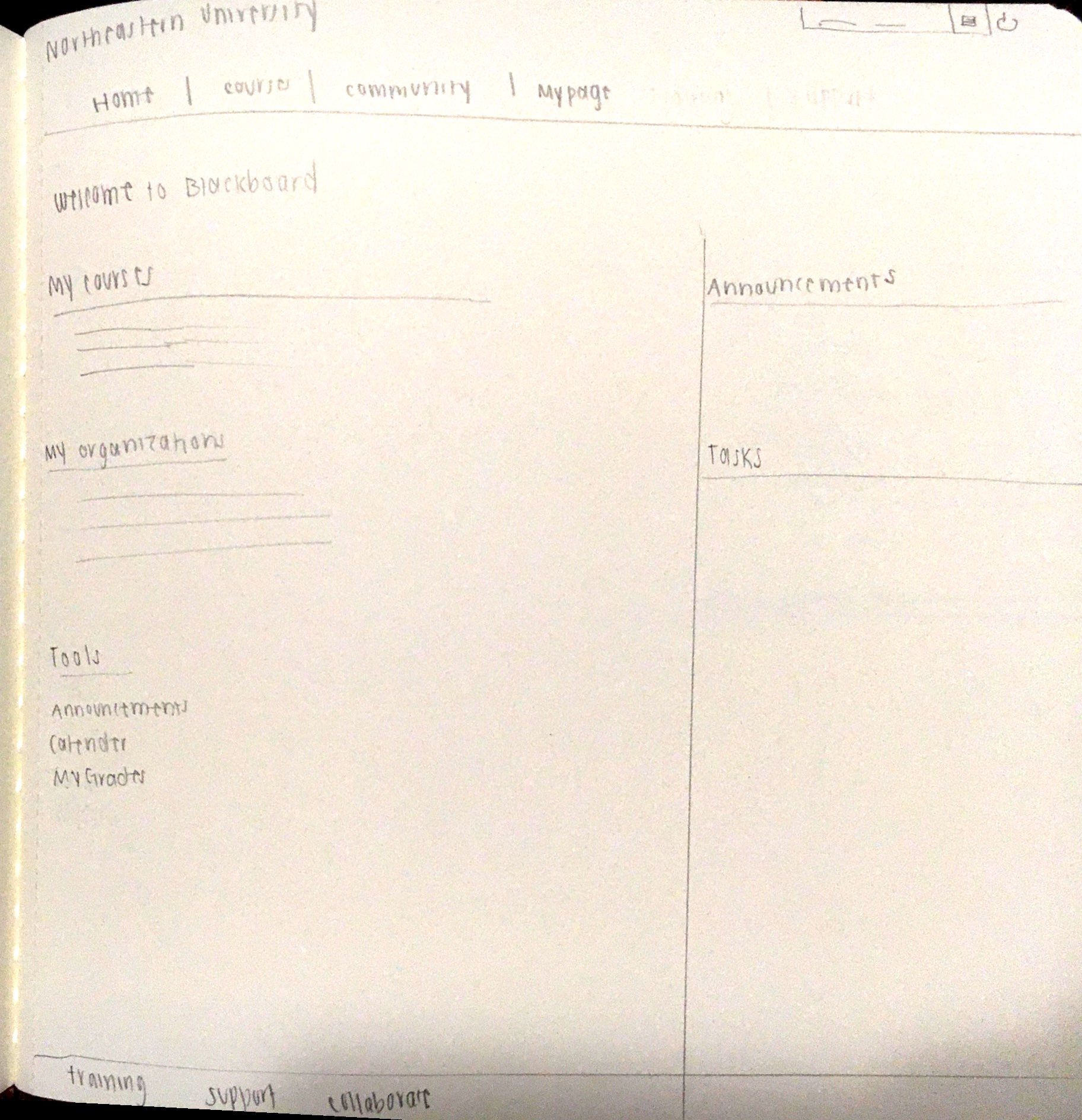
This website is repetitive and difficult to navigate. On the home page, it would be clearer if the announcements and tasks remained on the right side, while the courses are listed first, followed by a list of joined organizations. The tools and other links would be right underneath. Homework, Syllabus and such tabs would be accessed on the specific course's page. The training, support and collaborate links would be on the bottom of the home page in smaller type.
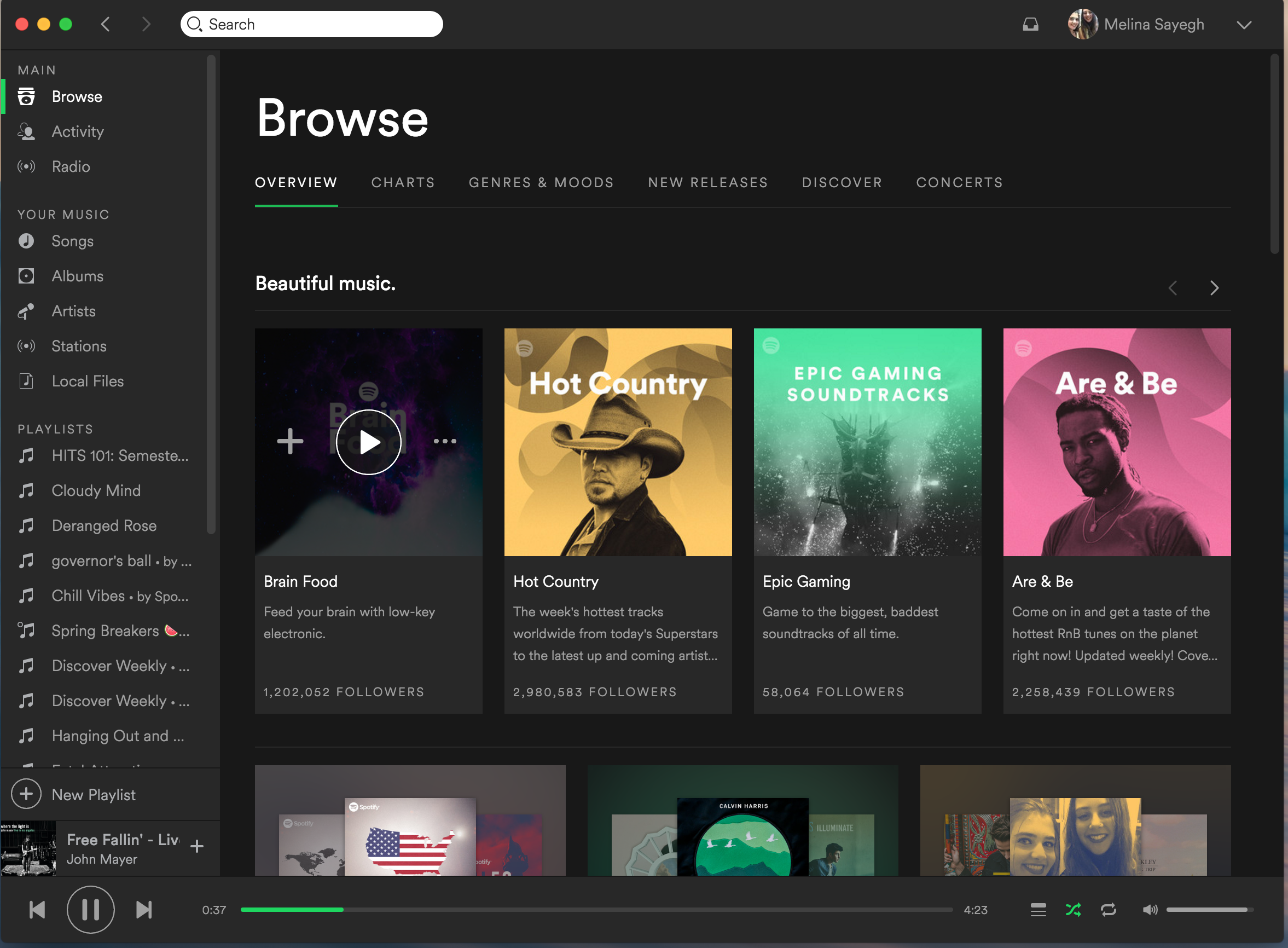
An example of great user interface design is Spotify's website. A platform for streaming music and sharing playlists with friends, the app makes it easy for users to queue and find new music. The feedback is well-designed so that links are bolder or underlined when hovering over. The site also adapts to the size of the window very well. Moreover, it has consistency with other music streaming apps, as well as across all of its interfaces, including the web app, phone app and website. Minimizing user memory load, there are the generic commands such as play, pause, replay, and skip easily accessible, but also visible commands for queueing a song or shuffling a playlist. The icons for these commands are simply designed and consistent with what is expected. The volume and tracking bars are also visible. There are many shortcuts including the ability to browse music by the artist or album of the song that the user is listening to or even to save that song. Also, the user can hover over a playlist name and play or save it directly.

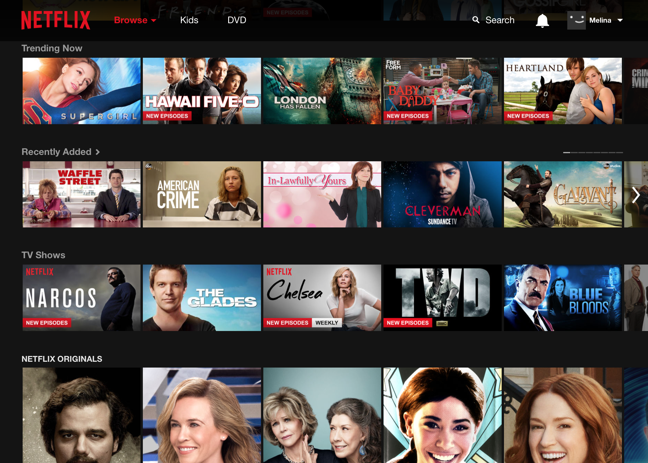
Another great user interface design is Netflix's website. There is also consistency between all of Netflix's platforms. The website has great feedback. Hovering over a television show enlarges it and it is easy to navigate left or right across lists by clicking on the arrows. This design is much improved because when an earlier design allowed scrolling through the list simply by hovering over the left or right ends, it was easy to scroll too fast or to pass the desired title. There is also clear navigation to browse a certain category or to search for something. Therefore, it also minimizes user memory load because of how visible these features are and how internally consistent the lists of movies and shows are across the screen. This simple repetitive design allows for easy navigation.

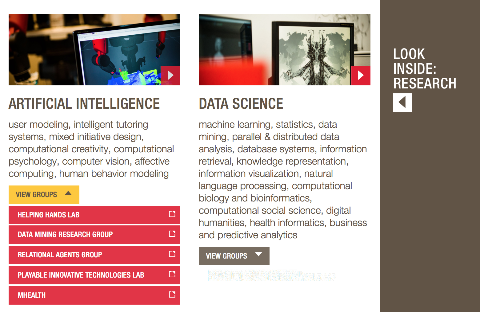
This website to inform prospective or current students about the CCIS department at Northeastern is poorly designed in consistency. Throughout the many tabs of this site, there is use of a triangle icon at the bottom right corner of boxes meant for users to click on in order be redirected to that link. However, there is feedback whenever the cursor is hovered over anywhere in the box, not just over the arrow. Not only is this design of the arrow inconsistent with the association of it to the playing a video, but it is also inconsistent within the page. There are three different uses of it on the same page. For example, the arrow on the right side where there is a panel, opens and slides the panel across the screen in the displayed direction. The arrows pointing down open a collapsible menu. However, the arrow on the other boxes do not slide open in any direction but redirect to a new page. These arrows are on images, which further confuses the reader because of the connection to the standard of the play feature. In addition, specifically on the home page, there are two YouTube videos where there is the use of similar arrows that when clicked, do actually play a video. In this case, functionality is what is expected. The inconsistency of all of these similar arrows across the website that serve different functions are confusing and, therefore, poorly designed.
I think that removing all of the arrows except for the ones facing down to open the menu would greatly improve the design of this interface because this consistency is significant. Placing a differently designed arrow, one that looks like a wide caret (^) would serve as a clearer mark for the user to understand that the panel slides across.

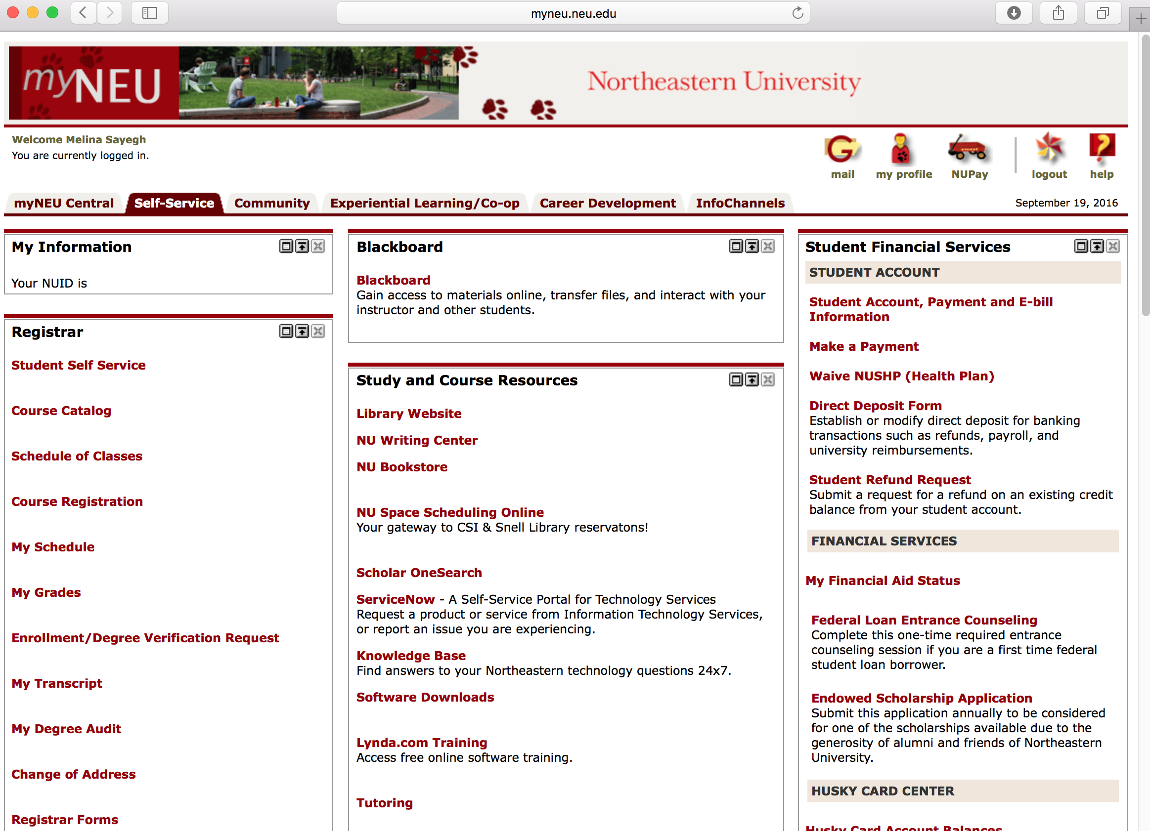
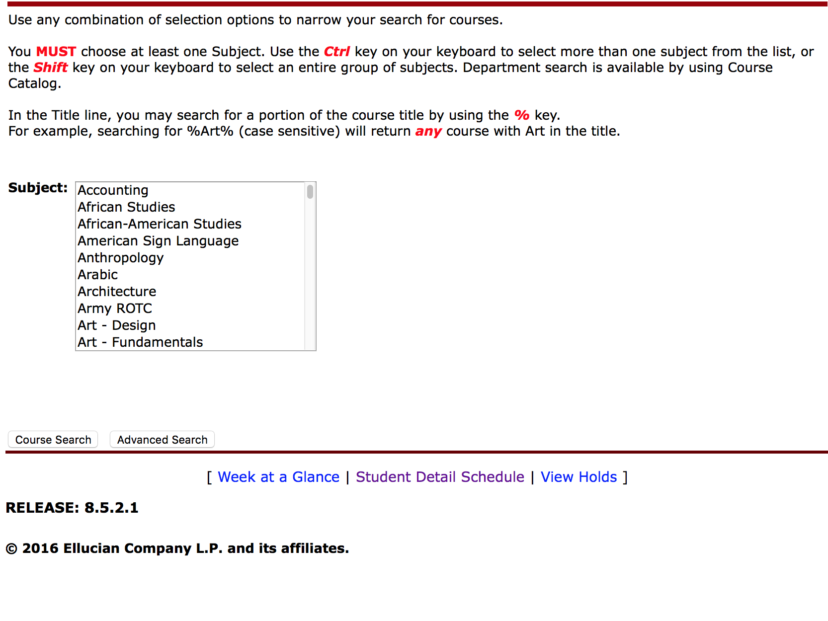
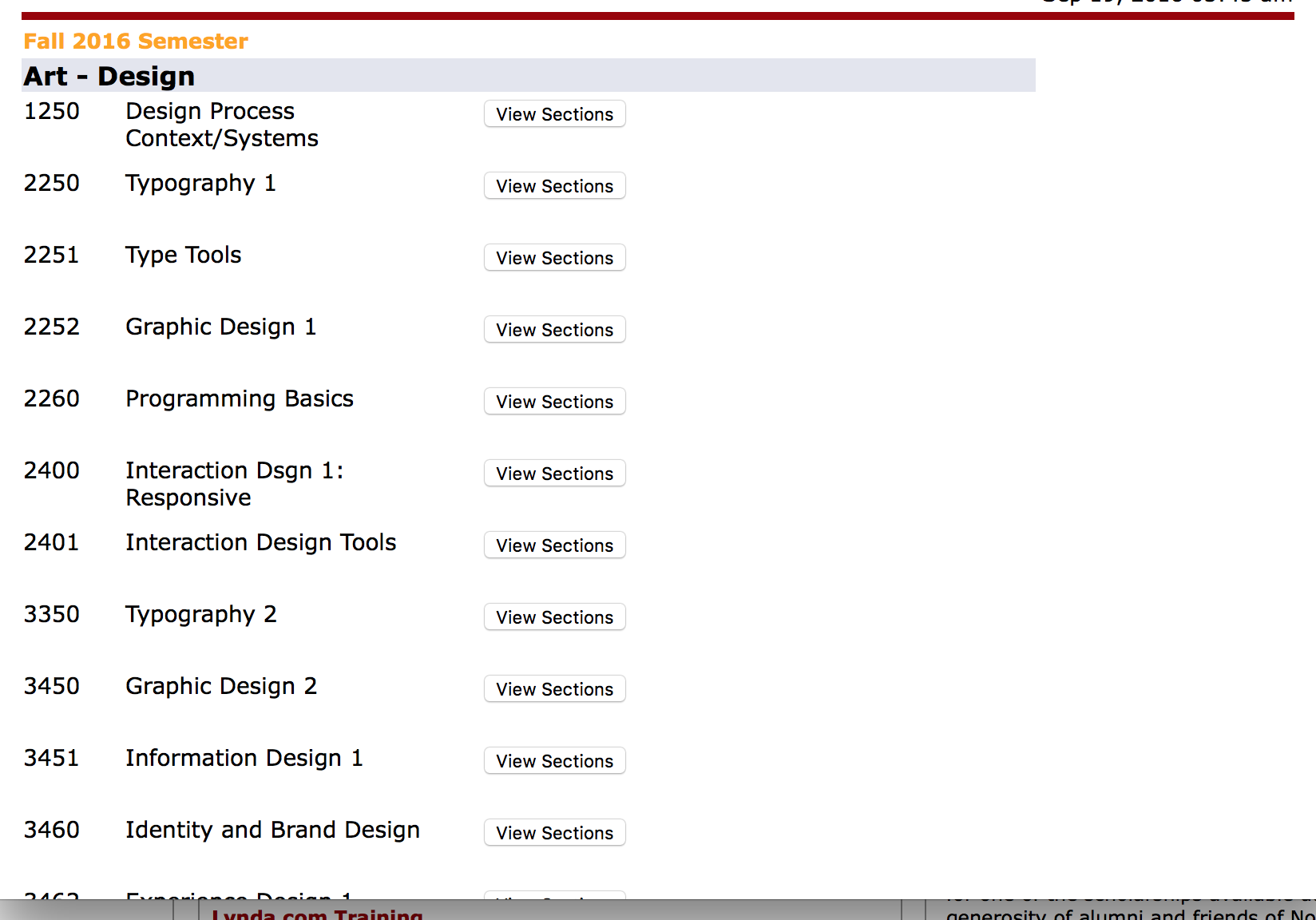
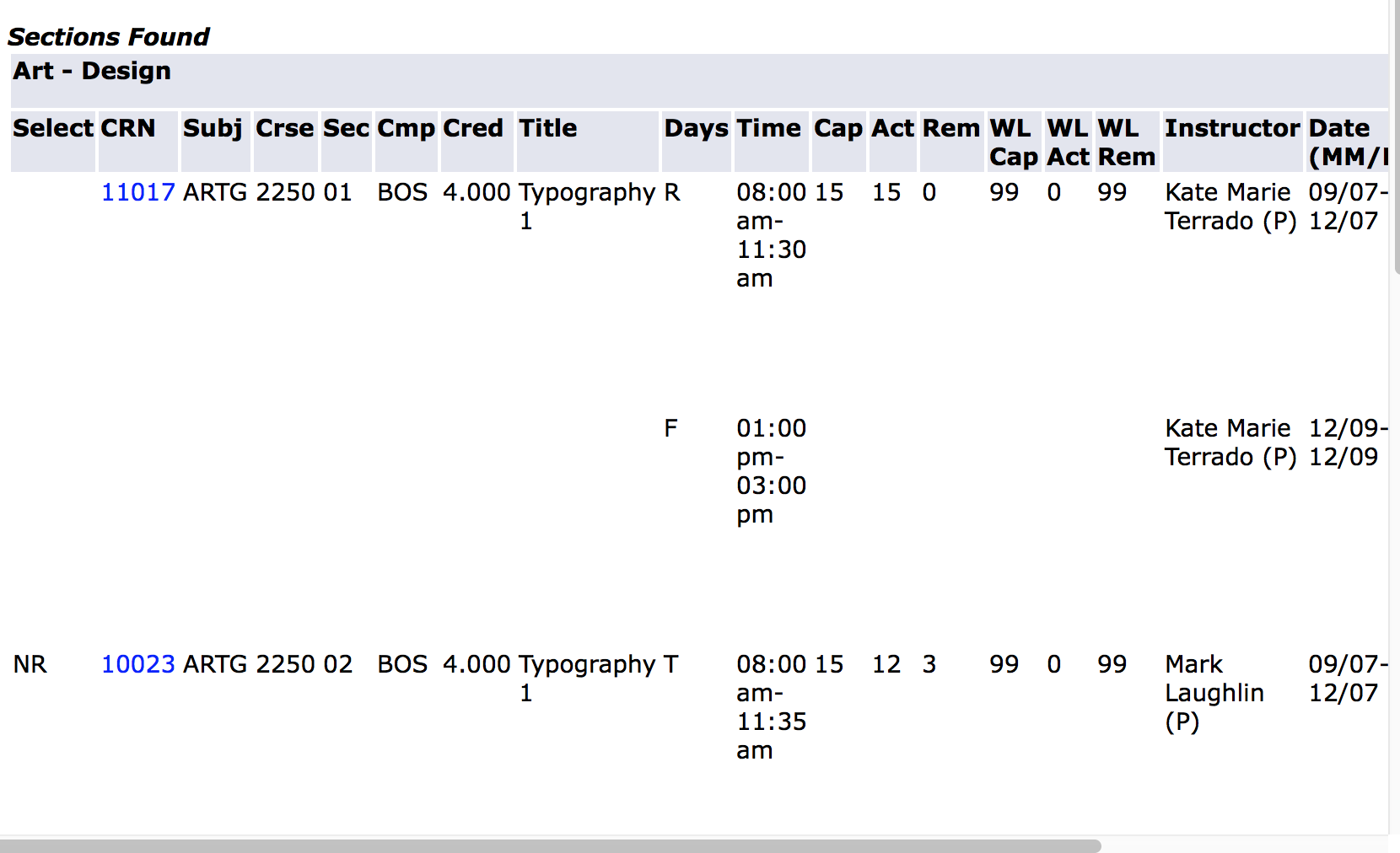
An example of a bad user interface design is the Northeastern myNEU website, the purpose of which is to allow users to register for classes, manage their husky cards, and connect them to other student resources. Therefore, this site is incredibly significant and is used by all of Northeastern's students. There are many aspects of why the design is bad including the response time of the login. Because of the slow feedback, users may click the login button again or click enter on their keyboard; however, this causes an error and the user must login again. The site especially fails to have a simple design and well-designed shortcuts. Although all the links are visible on the page, because of the numerous panels, it is difficult to find the correct one, especially for a new student.
I would suggest to have a left side panel of the most used links, while the others are listed in groups horizontally under headings that are listed in one column.
Furthermore, a student trying to register for courses can only look up one at a time and can not go directly to that last page, but would have to start over to look up a different class even if it is in the same category. This is terrible visibility and also maximizes user memory load. A better design would allow for shortcuts to the course and allow the user to easily go back to the last page. This would also help reverse error in case they clicked the wrong course. Lastly, I would also suggest that the site adapt to the size of the window when minimized.


I chose to focus on why people choose to sit in afterHours to do work rather than the library or elsewhere in the Curry student center. There is the struggle of finding a place on campus that is not too loud or distracting, but also not too quiet so that any noise is a disturbance. afterHOURS is a small lounge on campus with both a Starbucks and a stage for live music performances. In fact, afterHOURS is described by Northeastern as an entertainment venue and even a nightclub. However, during the day, it serves as another workspace for students. Because it’s the only Starbucks on campus, there are times where the small space is very busy with people getting coffee, and there are often more people waiting in line than people sitting down, which on average was thirty people. Seating is also scarce in afterHours, as there are also only smaller tables with two or four chairs and a few couches. I was curious to see whether students came there to be alone and be productive, to meet friends and socialize, or just to find somewhere to pass the time in between their classes.
I found that most people are there alone, and only one table is a group of more than just two people. Almost every student sitting alone is on their laptop. When I first arrive around lunch time at 1:30, most of these students also have food from the Curry dining area with them, specifically from West End. Furthermore, most of these students sitting down are wearing headphones, even if they are sitting with another friend. The use of these headphones implies that they aren't here for the music or to socialize with others. I notice that most people choose to sit in the corners, facing everyone. These people seem to be there for the longest, while students sitting at the tables in the middle of the room are not only less focused on working, but leave after less time. Of three students who come while I'm here to sit down, two of them spend time on their phone before even opening their backpacks to pull out their laptops. The students who are at the corners of the room are also the most productive and are constantly focused, while many of the other students sitting in different areas spend considerable time checking their phones or are constantly opening their Facebook pages.
I interviewed four individuals, two who said they come to afterHOURS often and two who were there for the first time because the library was too busy. The first girl I interview is sitting at a hightop table right next to the Starbucks line. She just has her laptop out and a finished salad from West End. While she comes to afterHOURS often to do work with the two hours she has in between her classes, she is not doing anything productive today. She has chosen to come here to eat and relax before her next class because of the nicer environment. One of the very few people not wearing headphones, she prefers the music that plays here, especially over the silence of the library or noise in Curry. However, she never comes here when she needs to study for an exam.
I also choose to interview a girl hunched over her laptop who seems very focused and is facing the wall. A design major, this international student does not live on campus and, she too, is waiting for her next class. She has been sitting down for two hours, drinking her coffee and working on her project. When I ask her why she has chosen to come to afterHOURS, she says that she would have preferred to have gone to the library and that this was actually her first time here. She would not even have been in afterHOURS if she would have been able to find a table somewhere else in Curry.
Another student I spoke to, a nursing student there to meet her classmates to go over notes, was in afterHours for the same reason. She also had never come to work here before and was finding it very distracting, especially in comparison to the quiet collab room she usually has reserved in the library. Coming to afterHOURS was convenient because of its proximity to the library and the availability of coffee. However, she wouldn’t come back here to do work.
Lastly, I interview a Cellular Molecular Biology major with a Music minor, who was also premedicine. He comes to afterHOURS to do his work often when he’s done with class everyday around 1 and usually stays for three hours. He loves the atmosphere and the coffee house feel. When asked whether he ever finds it distracting here, he answers that the coffee lines don’t bother him because he’s so focused on his screen; however, there are live shows every once in awhile that are still occurring when he arrives and can be distracting, but he’s never left because of them. What he actually finds the most distracting are the TVs. As a fourth year student, he finds the silence of the library no longer effective and needs noise around him, but the first two floors of the library are always busy. It’s also hard to find a spot in the Curry Student Center, as it doesn’t have a designated study space and it is hard to find a table that is clean.
Discluding the students who regularly come to afterHOURS, I found that most of the students are either here because they could not find a space in the library or because they were getting lunch from Curry. However, these students choose not to sit in Curry because of how busy it is and find afterHOURS more clean. While about half of the students were drinking Starbucks, I found that only one of the students I interviewed was actually somewhat there for the coffee or even drinking any. Students entering the lounge to do work will gravitate towards the ends of the room. Another reason for this may be cause of the very few outlets in the room available to any of the other tables. Also, people there alone took the same approach, while groups of two to four would sit towards the middle of the room. Variations include the number of people at a table. For example, there was only one gorup of more than two people. Also, most students were on their laptops. Only two people in the room where working from a textbook. Also, there was an older woman reading a book on a couch at the end of the room, and there were two older men who came in later to eat their food from Curry. Everyone else was a student, however there was a woman who came in to hand out flyers.
Through conducting these interviews, I found that there are many students who find themselves working in afterHOURS just because they can’t find a table in the library. While students like the atmosphere, many of them find it too distracting, especially during the coffee rush that seems to occur every twenty minutes. It seems that most students find it easy to grab lunch, especially from West End, and wait here until their next class. Therefore, afterHOURS can be a convenient location to spend that time. However, while people enjoy the coffee house atmosphere, it is still very distracting.
There wasn't really any interaction with others either. During my interviews, the girl facing the wall did not appreciate the distraction, but the others I interviewed were very helpful and happy to talk to me, even inviting me to sit down at the table with them.
While there are ways in which technology could help students in their productivity in working, there are also technologies which should be eliminated. For instance, there should be more power outlets around the room or even a charging dock. While most students come alone, it could also be beneficial to have two bigger tables for groups coming to the lounge because it is difficult to find tables to pull together and there was barely enough room for two girls to have their notebooks out to study. However, the televisions serve as more of a distraction. I didn't notice anyone actually watching tv and there are five of them around the room. I also found these distracting. Because these tvs might be there for late events in the lounge, I think it would be sufficient to just turn them off during the day. In addition, scheduling the love music events to be later in the day would allow more students to attend them but also not dstract the students who are there during lunchtime to do work. Although a band was not playing during my study, I have been there during a show and have noticed that not many people know the band or even realized there would be an event.