Heuristic Evaluation
of Team 4’s Project:
By Lazlo Ring – lring@ccs.neu.edu
Nielsen’s Heuristics
1. Simple and Natural Dialogue:
a. All screens are free of extraneous graphics.
Severity: NA.
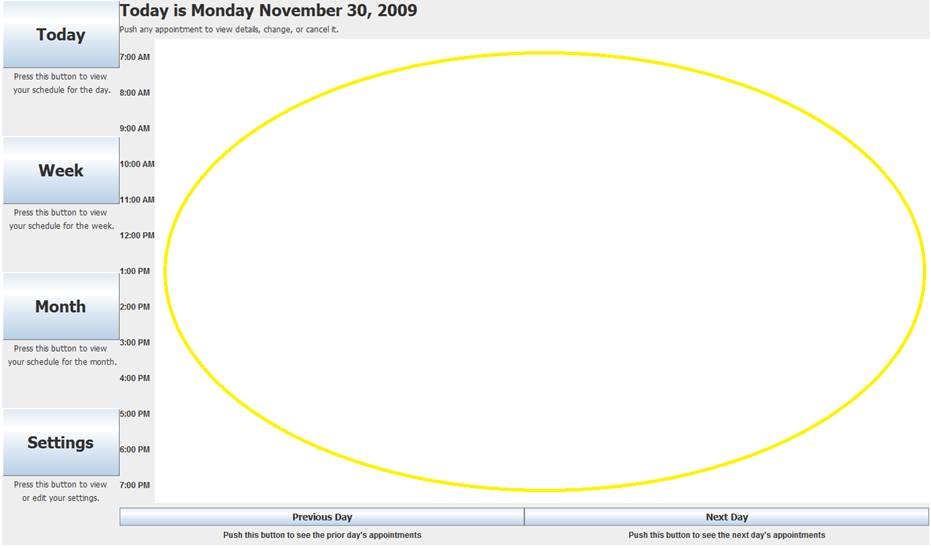
b. No graphics on the today option may lead to confusion, grid lines would help.
Severity: Minor.
a. A list of all upcoming appointments may be a helpful addition.
Severity: Suggestion.
2. Speak the User’s Language:
a. All terms in the system are appropriate for the target age group.
Severity: NA.
3. Minimize User Memory Load:
a. All screens tell the user what they are currently doing.
Severity: NA.
4. Consistency
a. The system has a consistent look and feel.
Severity: NA.
5. Feedback
a. The system keeps the user informed of the system state.
Severity: NA.
6. Clearly Marked Exits
a. You have to click on the X in the top right corner to exit any of the “Details of your appointment” frames.
Severity: Major.
7. Shortcuts
a. There does not seem to be any shortcuts in the system.
Severity: NA.
8. Good Error Messages
a. You cannot seem to get into a state that allows for an error to occur.
Severity: NA.
9. Prevent Errors:
a. You are not allowed to select when you wish to reschedule so the event may become forgotten about if the user does not receive a call from their doctor.
Severity: Major.
b. Settings button brings you to the Reminder Page.
Severity: Catastrophic.
10. Help and Documentation:
a. The system provides explanations of what each button does.
Severity: NA.
Additional Comments:
11. Some of the boxes in week do not respond to double clicks (Blood Test for example).
Severity: Catastrophic.
12. You have to click directly on the text in month to view the next frame, instead of within the box.
Severity: Major.