|
|
4 Examples:
- Example 1: CCIS Web Page Top Navigation Bar - Bad
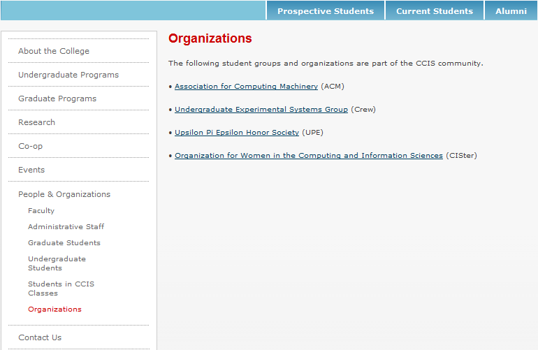
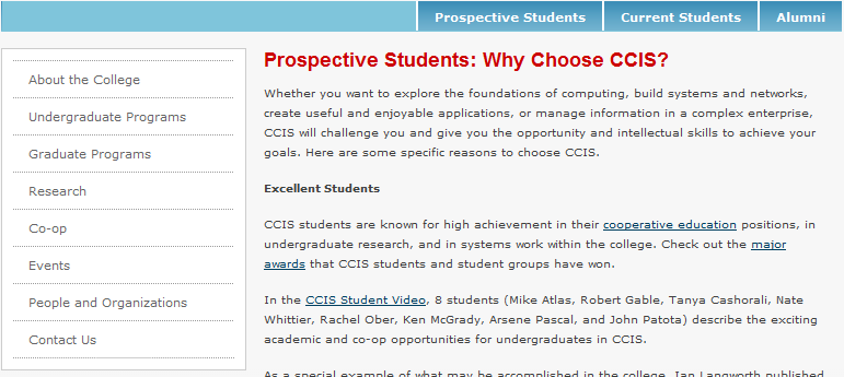
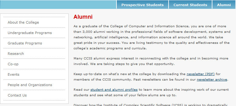
Current version of CCIS web page has two navigating area: one on top,
which is flat and consists of 3 buttons; the other on left, which is hierarchy.
These navigation areas suppose to tell users where they are now. When you click
"Current Students", it will take you to "Organizations" under "People &
Organizations" section. But when you click "Prospective Students" or "Alumni",
it will lead you to a page that is NOT belonging to any section on the left. So
at this point, you don't know where you are. It's a different experience from
the "Current Student". In user's point of view, this is a discontinue user
interface. So my suggestion would be improve the hierarchy menu and cancel the
top.
Pic1 - Click "Current Student":
Pic2 - Click "Prospective Students"
Pic3 - Click "Alumni"
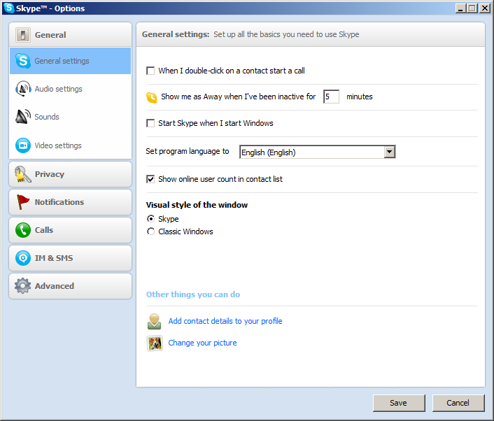
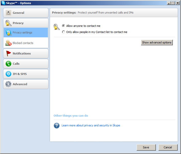
- Example 2: Skype Options - Good
Skype options panel I think is a good design. First, its layout is very clear:
on the left are a well defined catalog and one unfolded sub catalog; on the
right is current highline setting panel. This design goes well with users’
commonsense. That means it almost cost no time for users to learn how to use it.
Second, there is animation when user change catalog items. This may help user
recognize the process of transform between different catalog items. Third, in
some setting panels, some advanced options are hidden so that user may not be
bother by those functions that rarely use. But when it’s necessary, user can
easily find them by click “Show advance options”.
Pic4 - Skype Options
Pic5 - Skype "Show advanced options"
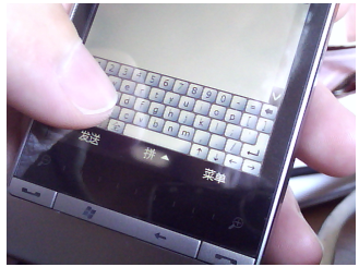
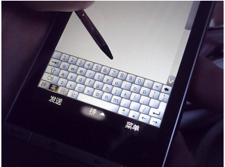
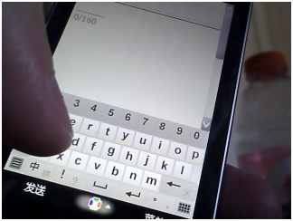
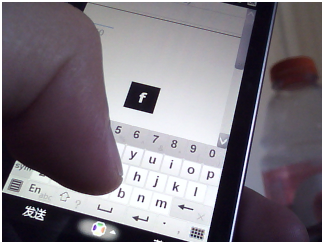
- Example 3 & 4: Windows Mobile Soft Keyboard - Bad vs. Good
To use an old fashion Windows Mobile soft keyboard is a very bad idea,
especially on cell phone alike devices that interact with a very some touch
screen. A good keyboard will greatly improve users’ input speed and reduce typo.
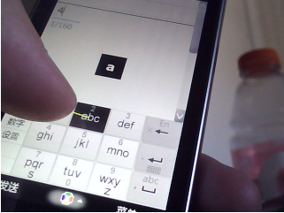
But in this soft keyboard, as shown in Pic6 to Pic8, you find neither. Because
its keys are too small to touch even to see. In Pic7, it shows that a finger is
much bigger than a key. So it can’t guarantee which key user just touched. And
also when finger is on keyboard, user can’t see keys.
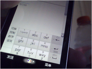
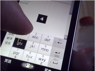
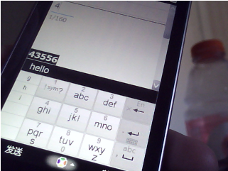
There is another version (Pic9 to Pic10) just a little bit better than the
previous one. It modify the key size a little bit bigger and put on a new
function that show the key in the screen center while it’s being touch. It’s a
little bit better but still not a good design.
So the next version come with a brilliant idea that with a 9-keys keyboard. The
big buttons fix the problem cause but hardly see small ones. And each button has
5 different ways to touch. They are center, move up, move down, move left and
move right. That means every button can represent 5 different letters (as shown
in Pic12 and Pic13). Finally it supports input method like T9.
Pic6 - WM Small Soft Keyboard
Pic7 - WM Small Soft Keyboard Compare to Big Finger
Pic8 - WM Small Soft Keyboard with Pen
Pic9 - WM Improved Soft Keyboard
Pic10 - WM Improved Soft Keyboard with Letter Display
Pic11 - WM 9-keys Soft Keyboard
Pic12 - WM 9-keys Soft Keyboard with Gesture 1
Pic13 - WM 9-keys Soft Keyboard with Gesture 2
Pic13 - WM 9-keys Soft Keyboard Input
|