Can the changing demography and economy of the neighborhood be potentially positive in terms of improving the Chester Square Park?
This visalization shows 3 plots. The first one shows the number of occupied housing units in the South End from the year 1950 to 2018. The second plot shows the percentage of owner-occupied houses throughout the years and the last plot shows the percentage of the labor force with changing population throughout the years. This is to give the insight that from year to year the percentage of owner-occupied housing is increasing which means that more people are choosing to live here permanently and will be more willing to come forward for the improvement of the neighborhood that they live in and have a house of their own. It can also be seen that throughout the years the labor force is also increasing which means more people can contribute if needed. We created this plot with the hypothesis that rental-owned houses are increasing hence people are not very concerned about the park in a neighborhood where they are temporarily living. However, the results we found were different and proved our hypothesis wrong.
Interaction: 3 of the plots are brushable and linked to each other. The user can brush on any one of them and the corresponding points on the other two plots will also get highlighted and in addition to that, a table also appears giving the detail for the selected points for the 3 plots.
Info
Year
Population
% of Labor Force
Number of occupied housing units
% of owner occupied housing units
From the Boston census data, we could garner insights on the population living in the area surrounding Chester Square Park. We find this information to be vital because the improvement of the park largely depends on the interests of the residents in the area.
Knowing the population and dominant age group in an area, it's possible to come up with common interests and hobbies among the population. These interests can be targeted to deriving the various social activities and amenities that can be supported by an improved park.
Insights
We gathered, cleaned, and visualized data pertaining to population and age group in order to gain insights from:
Population in Boston by area
Age group around Chester Square
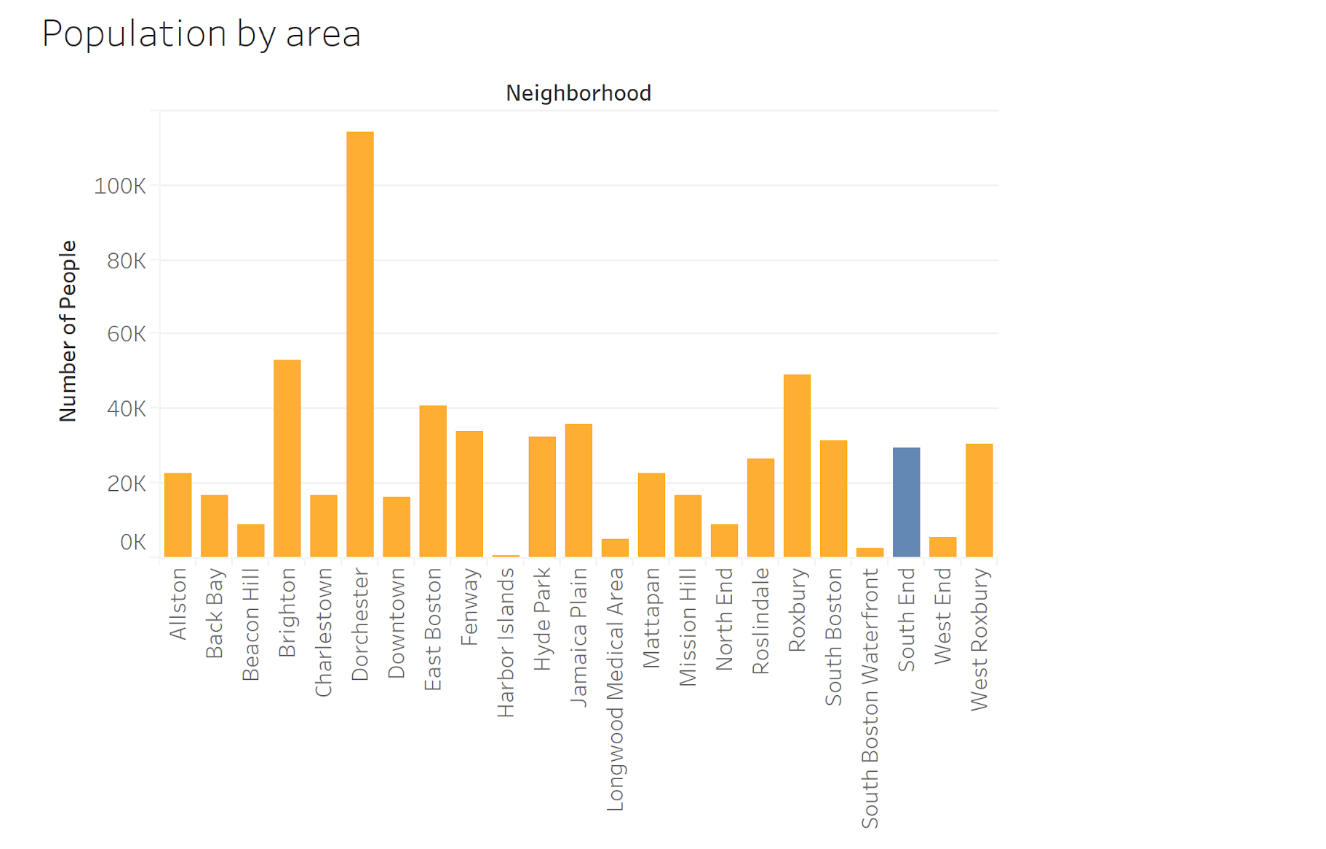
This figure compares the population in the main areas of Boston. We can see that South End, while not as densely populated as Dorchester or Brighton, is still a well populated area. Its population can be compared with the likes of Jamaica Plain, South Boston, West Roxbury, Fenway, and Hyde Park to name a few. We can use this information to compare parks among similarly populated areas, and see what the successful ones are doing right and what Chester Square Park is doing wrong. We can also conclude that the relatively high population indicates that there are a good number of people who'd visit the park if it's maintained well.
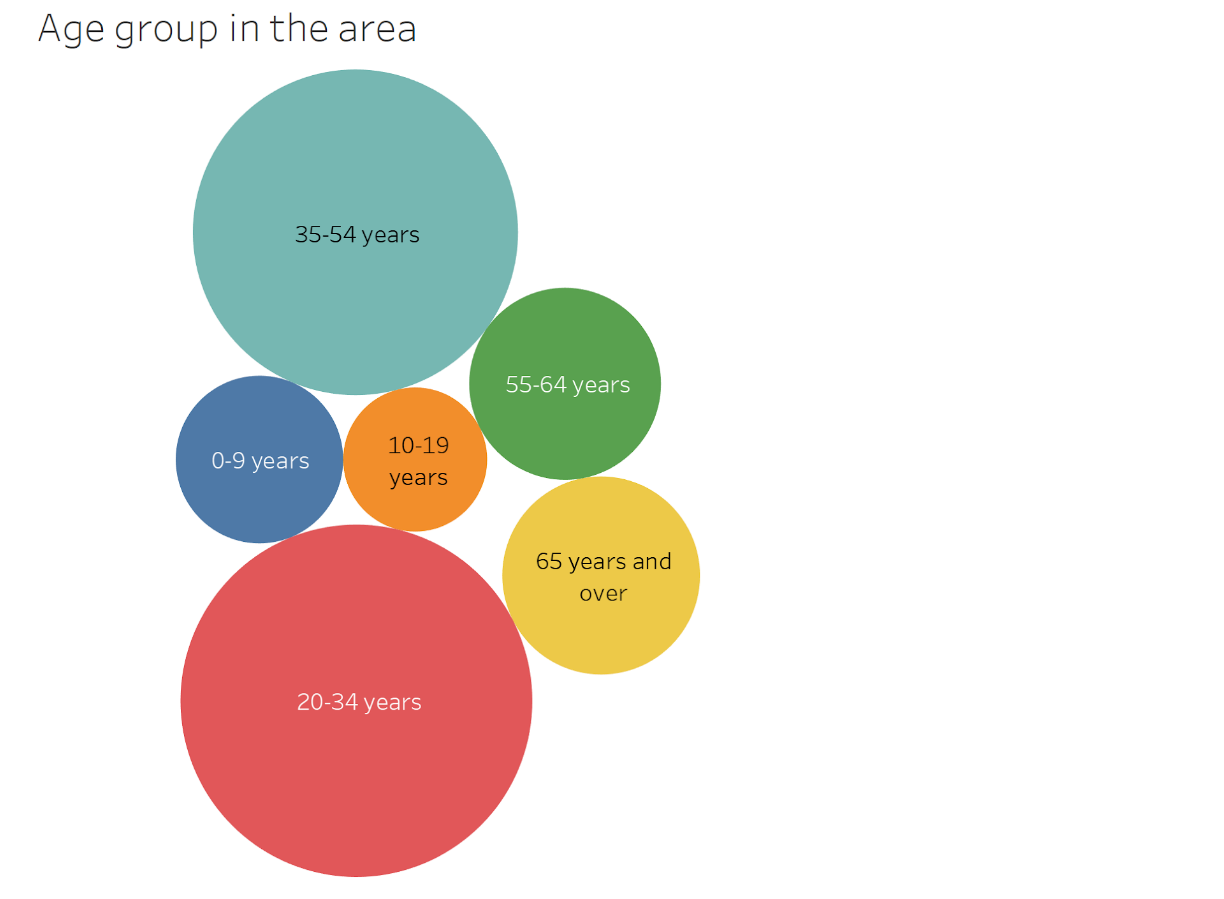
From this diagram, it is clear that the neighborhood is dominated by people aged 20 - 54. Though it's a high range, we can conclude that parking would be a necessity to the majority of the residents, as most vehicle owners fall in the above range. We can also target activities and interests pursued by this age group, and come up with ideas that revolve around these interests to improve the park. These are just 2 of a number of insights that can be garnered from the data.