This is an open mind, closed book, closed notes, no calculators, etc., exam. This exam is markedly reduced from the original design and is worth 125 points of the total 1,000 course points, rather than 250.
In answering these questions, try to avoid generalities. It would help is you could give or create a specific example to illustrate your points.
The notes below, 5/16/99 are based on the text, on answers by the students, and on my own reflection on the answers good sense and argumentation on the answerer's part. Thanks to many of you for your interesting insights into the many issues raised in the Midterm.
It was difficult to get full credit for particularly brief answers, because there are so many aspects to the material in the questions.
Q1. Discuss usability testing for an application that is complex enough that the user must study the manual in order to use it -- how does this differ from testing an app that can be learned by exploration?
It is not the case that the need to use a manual imply that the app is intrinsically more difficult to use once the user becomes familiar with it. Even tiny apps often have manuals. Manuals often expose clever implementations that would not be obvious in exploration, or would take too much exploration to discover. But once understood they may be very powerful and easy to use, e.g., drag-and-drop of links in a web authoring tool; dragging URL icon to desktop in Netscape.
Some students included lengthy narratives about using simple and complex applications, but never actually described what the process of usability testing might be for a complex app that required a manual.
It's obvious, but important to say, that in testing a complex app, it's useful for the tester to use some tasks that are obvious from the interface (Save, Print) and some tasks that are not and must be learned from the manual.
A shift in the objects of memory: When a manual is easily available, the user needn't remember how to do complex and rarely used operations, putting a strain on their memory. Instead they need only remember that there is an explanation of how to do the operation in one or two places in the manual, and they only need to remember how to find the item quickly in the manual -- from the table of contents or index or chapter headings, etc.
Manuals may be online also. There is a continuum in the spectrum from tooltips and balloons to small help items, to a fully indexed help system, to step-by-step interactive guides, to fully indexed fully typeset and illustrated manuals -- intro, user, and reference manuals.
Tester needn't interfere excessively during testing. The subject could be brought in for a long day of testing or for two days, half of which involved studying the manual, possibly with some general goal in mind, possibly not. It would be inadvisable to give the user the manual to study overnight, because you have no control over how much time they spend at it and how much they did or did not concentrate on studying it.
Certainly, you're also testing the manual in the situation envisaged in this question.
Another mode of testing, rather than having a specific goal, is for the user to go through the manual, and attempting to do the things described. Some systems provide sample files for modification or other simple exercises or examples.
Some students related their experience with learning applications that required a manual -- those insights were often helpful.
In a sense, the manual is part of the "interface" that the system presents to the user. It simply tends to be more static.
Forcing a user to read a great deal in the manual to understand the basics violates the principle of internal control -- the user is not in charge any more. Modular manual design and a good cross-referenced index helps.
Apps that are easy enough to learn by exploration may be too simple to satisfy the user after they have more experience with the system or want to do more complex things. Complexity is often positively correlated with power and flexibility in an app. On the whole, it is less likely that a user can learn to do complex operations merely by exploring.
A manual may function to overcome certain unintuitive features of an interface by simply stating how certain things are done. Thus, we are testing the entire application, as the app itself plus the manual.
A truly complex system can't even be learned efficiently using a manual and exploration, e.g., a nuclear power plant control console(s) or an air traffic control system. Learning these will involve manuals, classes, demonstrations, testing the user's proficiency, etc. Nevertheless, such systems must be examined determine their usability. You would not want a person to learn how to run a nuclear power plant by "exploring" the various operations such as Emergency Shutdown", etc! Training and testing of these systems is often done with simulations, not the real thing -- same for flight simulators and the underlying design of the displays and controls.
NASA recently announced that the Space Shuttle controls will now be on-screen, rather than consisting of physical switches, buttons, knobs, and meters. Another interface to test by simulation!
Q2. List the advantages and disadvantages of having an experienced user versus an inexperienced user in doing usability testing of a revision of a well-know application.
Would be particularly useful to compare the testing results from the two types of users, to sort out some of the problems mentioned below.
Some people mixed together the four categories below, in their answers -- confusing!
We shouldn't worry too much about the fact that testing of inexperienced users takes time and may progress slowly. If a company wants new purchasers of their system or has new employees who must use the system, then they assume that the testing of the app with inexperienced users should be done and they just have to spend the time it requires.
To some extent, the advantages of the inexperienced users are closely related to the disadvantages of the experienced users, and the disadvantages of the inexperienced users are closely related to the advantages of the experienced users. But all four cases are included for completeness.
All in all, answers were a bit better than those for Q1. Many of the points below appeared in a number of different students' answers.
Inexperienced
UserWon't have conflicting experience with the prior versions. Will
detect non-intuitive parts more easily. If the user base is expanding,
satisfying new users is very important. Can compare tests on revision
to similar tests on prior versions -- unbiased test. Also, an
unbiased tester of the new features. Novices make more errors
and test error handling and recovery more thoroughly.
May not exercise shortcuts or advanced features very well. Hard
to analyze revisions in the face of all the testing on the basic
functions. If the previous versions had already been well-tested,
then the inexperienced user would be testing all the unchanged
features again, in addition to the new features.
Experienced
UserCan focus on testing changes. They will try out more features
of the application, including shortcuts. They may push for consistency
between revisions (could also be a disadvantage, if they want
to stick to their "old ways"). They will notice bug fixes to their
old annoyances (or the lack of bug fixes!). If this person fails,
the revision has real problems! If the user base is stable (not
many new users) then an experienced user is the most appropriate
for the tests. May point out subtleties the tester didn't notice.
How experienced were they when the test began? They may only really
know certain parts of the app. Are the problems because they are
"too experienced" with prior versions or because the revised app
really does have its own problems? They may be used to problems
from the prior versions and work around them and not complain
or be confused by a poor interface. They may resist or complain
about changes, even it they're for the better -- hard to teach
an old dog new tricks.
Q3. A grammatical rule, e.g., a command in a command language, can indicate an action and its result. So can a transition diagram. Give a few examples of how the same user action and result can be described by a command and by a transition diagram.
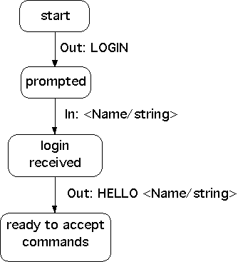
A simple example of a grammatical description that describes an action and its result is given in our textbook, bottom of page 159:
<Session> ::= <U: Opening> <C: Responding>
<U: Opening> ::= LOGIN <U: Name>
<U: Name> ::= <U: string>
<C: Responding> ::= HELLO [<U: Name>]
The same interaction could be described by a state diagram in the following way:
This is only one example and only in one particular style. There are any number of variations on this that are reasonable, as are shown in Chap. 5. (At the same time, there are many variations on this that miss the point!) In the diagram above, it would be easy enough to add a transition to an additional state that would be entered if the login was unrecognized, or a password is required that might or might not be correct, etc.
A number of people used a grammar for command line input and the state diagram for direct interaction. That is OK. But in the diagram above, I've shown the state diagram for the command line input itself.
One of the simplest examples given as an answer was the action of the backspace key, moving the cursor position from one position (initial state) to the previous position (next state).
One of the fundamental aspects of state diagrams was sometimes misunderstood: It is conventional for a state (designated by a circle or a box) to be a static point at which the system has certain parameters or variables set to certain values. The actions occur between the states and result in the movement from one state to the next. This can be subtle, because some states may consist of an announcement on the screen to a user, an announcement that names an action but is not in fact an action. It's good to try to make these points clear in any diagrams you draw.
It follows that a state diagram should have actions labeling the transitions between states.
Because this question was a bit complex and subtle, I graded it leniently.
Q4. Discuss a few advantages and disadvantages of an application with the following type of interface, which could be used for search, editing, system administration, etc.
The best answers were ones that discussed the advantages, disadvantages, and elaborations of the designed. The poorest were the ones that assumed that the system was designed poorly and then criticized it.
I ommited the obvious, that since this is an interface, the user does have the normal keyboard with accelerator keys, etc., a most likely, a normal mouse or touchpad.
The overall philosophy of the design is to organize and enlarge screen space enormously by having multiple "screens" in every "room". The design is partially a virtual reality design, but focused on fairly normal tasks. Rooms could be assigned to different topics, e.g., a room for your hobbies, a suite of rooms, one for each of the courses you're taking, etc.
The primary metaphor is one of a structured space. People have a remarkable ability to remember where things are in a 3D world, especially if the paths between them are distinctly marked and the locations have a distinctive appearance that rarely changes.
It would require a lot of computer power and memory to support a system such as this, but that capacity is becoming more readily available every day. Little computing power or volatile/local/RAM store needs to be expended on "rooms" that are not currently visible on the screen.
When you use a computer for years, you know what the folders are that you've chosen to keep certain things in. If you used the "rooms" app for years you'd know exactly where everything was. The system could have a "GO" command which would only require a simple, brief string to get to a room or a simple voice command, and you'd "be" there.
Tools in a programming class room might be a VB and Java compiler. Most of the rooms would probably have a mail tool, and all would have tools to resize the screens. The screens would presumably be used for browsing and editing, in the normal way. The question was a remiss in not pointing this out more clearly. We are alreadyused to tools in Paint andother applications, where we have tools for drawing lines or boxes, or erasing. WordCount in a text editor is a "tool" also, though it doesn't look like a physical tool such as a paintbrush or a hammer.
A screen in the room could be used as the MSWord screen and you could zoom in to see only that screen on your (real) screen. At that moment, all you'd see is Word. And you could arrange to pull up MSWord on any screen in any room, if you chose to. Or you could have a Unix login shell on a screen or xemacs on a screen, etc. So all the normal functionality could still be completely available to you.
Some were worried that it might not be obvious what a tool was for. But most applications these days have tooltips or balloons or entire help boxes available for every icon. So it would be foolish to think that this design somehow would lack this obvious help.
There were a number of people who had negative opinions about the interface, but instead of suggesting more sensible ways to do things, the simply complained -- not too thoughtful. They would pick on some feature, assume it was poorly implemented and then complain about what they imagined it to be. Usability focuses on "I don't like this" and User Centered Design focuse on why don't you do it this way -- a more positive and helpful approach, and quite appropriate for this question.
Some complained that the design was "unnatural", but it was specifically designed to mirror the real world that we're all very well adapted to and comfortable with.
The joystick interrace could easily be designed so that it was impossible to "crash" into the walls -- not quite moving on railroad tracks, but a "soft" version of that. In video games, you can crash; this app could simply not allow "crashes" to occur. So you wouldn't have to well coordinated to move around easily. In many drawing applications, holding down the shift key forces the drawing of horizontal or vertical line or a square instead of an arbitrary rectangle -- solves a set of coordination problems very neatly.
When some of the answers criticized the design, they did it by assuming the design would be poor and allow undesired things to happen. For example, in a Paint application, the eraser can't accidently erase the borders of the window or the menu titles or other non-Paint open windows. These things are controlled.
For the expert, the "cart" could essentially be a file folder that could have things added in one room and accessed in another. Otherwise, as some pointed out, the car metaphor would be too simple-minded for sophisticated users, but maybe great for millions of kids.
Though some thought the interface was too "jazzed up", there's nothing to prevent allowing command line work on the screens or to zoom in on a few screens so the "room" aspect is not apparent.
The problem of getting lost could be reduced by having a "you are here map, signs, or simply a "transporter" that allows you to pop back to the previous room(s) -- here, the "Back" command would be a form of "teleportation". Or you could simply point to a room on the map and click and you'd be there!
It might not be good for a user to be required to use the left-hand joystick also, that is true. But young people today are very used to playing two-handed games -- the tens of millions of game controllers sold tell us that it couldn't be very hard. Also, all touch typists, piano players, guitar players, etc., seem to do well with two-handed manipulation -- it's not at all a strange design in that respect.