London Underground map
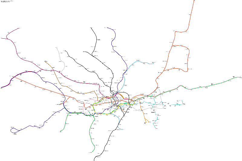
in a geographically accurate map.
Henry (Harry) Beck worked as an electrical draftsman in London. He worked to design a more readable and understandable map of the London Underground (subway) which led to his famous "schematic" design which used horizontal, vertical and 45° segments with the same topology and approximate geography as the true routes.
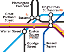
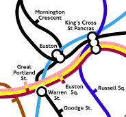
We first present excerpts from the current underground map, which retains, to this day, the basic design principles developed by Beck, followed by the same routes shown in the correct geographical positions.
|
|
|
| Fig. 1 Excerpt from the standard London Underground map |
Fig. 2 Excerpt of the same region in a geographically accurate map. |
Finally, there is a large map in PDF format that aligns the geographically correct Underground lines with a map of the streets of London. The PDF map is a vector-based graphic, so that zooming in on it will reveal further clear detail. Download the map (PDF) (page 39 of: Public transport in London: Market report 2000).
Below is an excerpt from Edward Tufte's comments on the London Underground Map. He claims that such designs do not "travel well". But at the same time he admits that there are deep principles of design in operation. I would only point out that it is the deep principles of design that do travel well. The principles clearly have to do with reqularizing the appearance of something while preserving some but not all of the underlying relations. So they may not be "practical architectures" as Tufte says, but they illustrate important principles. The schematic approach for illustrating protein structures developed by Jane Richardson is an example of the same deep principle of design. Her images are the corollary of the Beck maps whereas the actual positions and orientations of the amino acids in the backbone are the geographical correlates. (Richardson, J. S. (1985). Schematic drawings of protein structures Meth. Enzymol. 115 359-380)
Some relationships can be lost in such schematicizations. People have pointed out that using the stylized Underground map, one can follow what seems to be a sensible route, possibly including changing trains, only to end up a few hundred yards from where the trip started, not realizing that walking would have been much faster and simpler.
Tufte's comments:
"The Underground Map and Minard's famous Carte Figurative of the French Army's disaster in Russia in the war of 1812 are alike in important respects: both are brilliant, and neither travels well. The Underground Map and Napoleon's March are perfectly attuned to their particular data, so focused on their data sets. They do not serve, then, as good practical generic architectures for design; indeed, revisions and knock-offs have uniformly been corruptions or parodies of the originals. Both, however, exemplify the deep principles of information design in operation, as well as the craft and passion behind great information displays."
"There is a fine book on the map: Ken Garland, Mr Beck's Underground Map (Capital Transport Publishing 1994). The book describes the enormous care, craft, thought, and hard work of Harry Beck that went on for decades--exactly what it takes to do great information design and so in contrast to the quick-and-dirty practices and thinking of commercial art. Garland's book is also a model for writing histories of great information designs." -- Edward Tufte, January 11, 2002
Sources: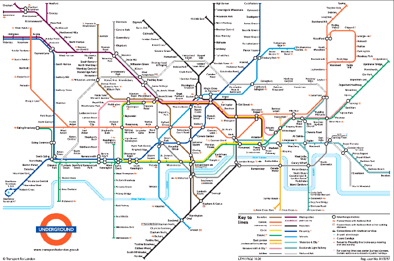