Pulse of the Nation:
U.S. Mood Throughout the Day inferred from Twitter
Video
A time-lapse video of the maps, cycled twice, is available below (best viewed at 720p):
Mood Variations
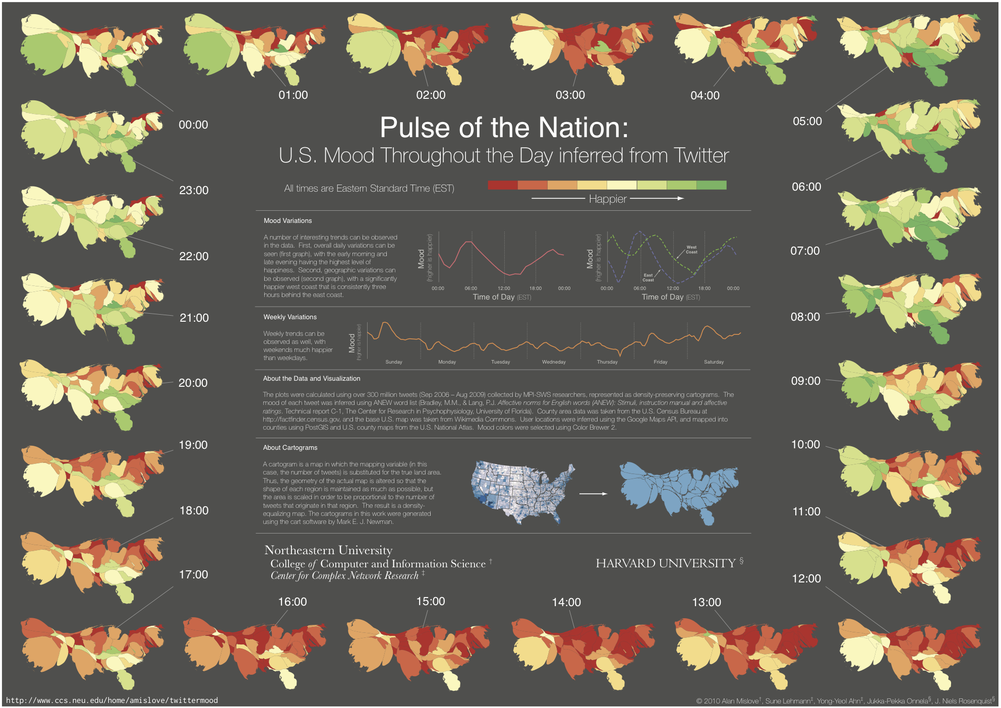
A number of interesting trends can be observed in the data. First, overall daily variations can be seen (first graph), with the early morning and late evening having the highest level of happy tweets. Second, geographic variations can be observed (second graph), with the west coast showing happier tweets in a pattern that is consistently three hours behind the east coast.Similar variations were discovered independently by Michael Macy and Scott Golder, and first reported in the talk "Answers in Search of a Question" at the New Directions in Text Analysis Conference in May 2010.

Weekly Variations
Weekly trends can be observed as well, with weekends happier than weekdays. The peak in the overall tweet mood score is observed on Sunday mornings, and the trough occurs on Thursday evenings.

About the Data and Visualization
The plots were calculated using over 300 million tweets (Sep 2006 - Aug 2009) collected by MPI-SWS researchers [1], represented as density-preserving cartograms. This visualization includes both weekdays and weekends; in the future, will we create seperate maps for each. The mood of each tweet was inferred using ANEW word list [2] using the same basic methodology as previous work [3]. County area data were taken from the U.S. Census Bureau, and the base U.S. map was taken from Wikimedia Commons. User locations were inferred using the Google Maps API, and mapped into counties using PostGIS and U.S. county maps from the U.S. National Atlas. Mood colors were selected using Color Brewer 2.
About Cartograms
A cartogram is a map in which the mapping variable (in this case, the number of tweets) is substituted for the true land area. Thus, the geometry of the actual map is altered so that the shape of each region is maintained as much as possible, but the area is scaled in order to be proportional to the number of tweets that originate in that region. The result is a density-equalizing map. The cartograms in this work were generated using the cart software by Mark E. J. Newman, available at http://www-personal.umich.edu/~mejn/cart.

Who We Are
We are researchers from Northeastern University and Harvard University, studying the characteristics and dynamics of Twitter.- Alan Mislove, College of Computer and Information Science, Northeastern University
- Sune Lehmann, Center for Complex Network Research, Northeastern University
- Yong-Yeol Ahn, Center for Complex Network Research, Northeastern University
- Jukka-Pekka Onnela, Harvard Medical School, Harvard University
- J. Niels Rosenquist, Harvard Medical School, Harvard University
Coverage
Our project has been covered extensively in the press. Below, we've listed some of the highlights.Television
- Tweets Map the Country’s Mood. CBS Evening News with Katie Couric (July 23rd). Watch the video here. Transcript available here.
- America's moods mapped using Twitter. Fox News 25 (July 23rd, 2010). Watch here.
- Scientists Use Twitter to Track Nation’s Mood. Fox News (July 28th, 2010). Watch here.
- Mapping Moods: Twitter Proves the West Coast is Happier. CBS 3 (August 2nd, 2010). Watch here.
News, papers, and periodicals
- When Life Is Sweet, According to Our Tweets. New York Times (July 24th, 2010).
- 300 Million Tweets Reveal the Afternoon at Work Is the Unhappiest Time of Day. New York Times (July 23rd, 2010). [VentureBeat]
- Tracking the National Mood Through Twitter. New York Times (July 22nd, 2010). [Bits]
- Thursday, the Unhappiest Day. New York Times (August 5th, 2010). [By the Numbers]
- America: Are you Happy? BBC (July 23rd, 2010).
- Thursday: Twitter’s Angriest Day. Time Magazine (July 22nd, 2010).
- Are West Coast Tweeters Happier Than Their East Coast Counterparts? Vanity Fair (July 22nd, 2010).
- Twitter Reveals West Coast Happier Than East Coast, Say Scientists. New York Magazine (July 22nd 2010).
- Proof From Twitter Research: Floridians Happier Than Rest of the Bitter Nation. Miami New Times (July 22nd, 2010).
- California much more jovial than East Coast, study finds. LA Times (July 23rd, 2010).
- Twitter Used To Gauge The Nation's Mood. Wall Street Journal (July 24th, 2010).
- Study of Twitter users finds daily, hourly mood swings. USA Today (July 28th, 2010).
- Twitter Visualization Shows When We Are Happiest. SF Gate/San Francisco Chronicle (July 21st, 2010).
- Twitter Mood: The Pulse of the Nation. CBS News (July 22nd, 2010).
- Happy People: Researchers Pinpoint Smiles (And Frowns) Using Twitter. National Public Radio (July 23rd, 2010). [all tech considered]
- Is The West Coast Happier? Twitter Says Yes. National Public Radio (July 22nd, 2010). [The Picture Show]
Blogs
- Time-Lapse Twitter Visualization Shows America's Moods. Mashable (July 21st, 2010).
- Twitter ‘Mood Map’ Tracks The Nation’s Happiness. Huffington Post (July 23rd, 2010).
- Twitter finds West Coast is happier than East. CNET (July 22nd, 2010).
- Researchers Analyze 300 Million Tweets to Create Mood Ring for America. Gawker (July 22nd, 2010).
- Map Measures U.S. Mood on Twitter. Technorati (July 22nd, 2010).
- Twitter Gauges Nation’s Mood. The Daily Beast (July 23rd, 2010).
- Twitter Research Proves California Is a Far Happier Place Than New York. Slate (July 16th, 2010). [The Big Money]
- The moodiness of the US, as told by Twitter. Engadget (July 27th, 2010).
Our side of the story:
- Do we tweet when we’re in certain moods? Big Questions online (July 26th, 2010).
- Is twitter a national mood ring? CNN (August 6th, 2010).
The most comprehensive list of stories that covered the project can be found here. For more information or media requests, please contact Sune Lehmann.
Acknowledgements
This research has been supported in part by the National Science Foundation as well as through an Amazon Web Services in Education Research Grant.References
- [1] Cha, M., Haddadi, H., Benevenuto, F., and Gummadi, K.P. Measuring User Influence in Twitter: The Million Follower Fallacy. In Proceedings of the 4th International AAAI Conference on Weblogs and Social Media (ICWSM), Washington, DC, May 2010.
- [2] Bradley, M.M., & Lang, P.J. Affective norms for English words (ANEW): Stimuli, instruction manual and affective ratings. Technical report C-1, The Center for Research in Psychophysiology, University of Florida.
- [3] O'Connor, B., Balasubramanyan, R., Routedge, B., & Smith, N. From Tweets to Polls: Linking Text Sentiment to Public Opinion Time Series. In Proceedings of the Fourth International AAAI Conference on Weblogs and Social Media (ICWSM). Washington, DC, May 2010.
© 2010 Alan Mislove, Sune Lehmann, Yong-Yeol Ahn, Jukka-Pekka Onnela, J. Niels Rosenquist. Some rights reserved. Images, poster, and movie are shared under the Creative Commons Attribution 3.0 License.