This project was inspired by the recent Twitter maps generated by Miguel Rios. Shown above is over 275 million tweets with embedded geo-tags (latitude/longitude). The map is scrollable and zoomable; the different colors represent exponentially increasing number of tweets coming from each location (lighter is more tweets). You can also explore a full-screen version or download a single image suitable to print.

About the data and map

The data consists of over 30 months of Twitter data, gathered between January 2011 and April 2013 (a total of over 10 billion tweets). Only 275 million of these have geo-tags, and these are the ones that are plotted. In fact, the only thing plotted in the map is the geo-tag locations; all of the roads and other features that are visible are present due to tweets that are geo-tagged while Twitter users are in those locations. There is no "base map."

A few interesting features

Below are a few interesting features that can be observed in the map:

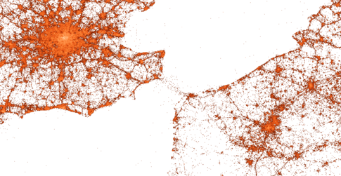
The above map extract shows the English Channel, running between England and France. The ferries between Dover and Calais are immediately visible. Similar ferries can be observed across the Irish Sea, going between Dublin and Holyhead/Liverpool, UK.

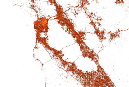
The extract above shows the San Francisco Bay area, including San Francisco, Berkeley, Oakland, San Jose, and greater Silicon Valley. The bridges and roads are visible, as well as features like Yerba Buena Island and the Oakland ferries.

If you zoom in even futher (beyond the level of the map above), certain regions allow you to see very localized features. The example above is Manhattan and parts of New Jersey and Brooklyn/Queens. The street grid of Manhattan is visible, as well as features like Central Park and Roosevelt Island.

About the creator

Alan Mislove is an Assistant Professor in the College of Computer and Information Science at Northeastern University. He can be reached at amislove (at) ccs (dot) neu (dot) edu.